Scoring genre clarity...
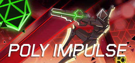
POLY IMPULSE is a minimalist fast-paced movement FPS where you will have to shoot colorful polyhedrons to impulse yourself through the level. Speedrunning is not an option, only the fastest with godlike aim will get the SS rank.
$14.99Very Positive(53)
ActionFPSDifficult
Dani Bedmar, MoromonMar 18, 2026