Scoring genre clarity...

Forgotten 23 capsule

Forgotten 23

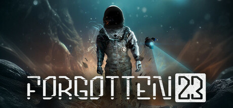
Space station Forgotten is in a decaying orbit and engineer Max Novak is the only hope of averting catastrophe with only 23 minutes and endless time loops to spare. Navigate a dark sci-fi adventure, learn more with every loop, solve challenging problems, and uncover the dark secret of the Forgotten.

$12.99Positive(14)
AdventureSci-fiThird Person
KovalGamesJul 18, 2025

Forgotten 23 scores 70/100 — better than 33% of Adventure capsules (n=7,922).

Positive (14 reviews) · $12.99 · Released Jul 18, 2025 · By KovalGames

Quick text summary

Forgotten 23 scored 70/100 on Steam Analyzer — Good for a Adventure capsule. Top priority fix: [uniqueness_polish] Add a subtle visual cue of the '23' timer or loop mechanic (e.g., a faint chronometer glyph or temporal distortion ring) to communicate the core gameplay hook beyond generic sci-fi action

Capsule scores by dimension

  • Genre Clarity: 7/10 — Sci-fi action with clear stakes. The silhouette of a figure in dynamic motion against a red energy explosion clearly reads as action-oriented sci-fi gameplay. At tiny size, the glowing red vortex and dark humanoid form communicate danger and intensity, though the specific loop mechanic is not visually apparent. The aesthetic aligns with space station survival themes but doesn't distinctly differentiate the time-loop puzzle core from generic sci-fi action.
  • Title Readability: 8/10 — Bold angular font, strong contrast. FORGOTTEN 23 uses a crisp, geometric sans-serif with high contrast white letterforms against the dark red background, maintaining excellent readability at full, small, and tiny sizes. The title placement in the lower third provides a controlled backdrop with minimal texture interference. The '23' integration as part of the title reinforces the core mechanic without cluttering the read.
  • Contrast & Color: 8/10 — High-saturation red vortex pops clearly. The central red energy explosion with strong warm-to-cool lighting creates excellent separation from the dark navy-black space background. The silhouetted figure maintains sharp definition through pure black against the bright red glow, reading cleanly even at tiny size. Value separation remains strong in grayscale; the mid-tone red shifts clearly darker than the white title, avoiding muddy blending.
  • Uniqueness & Polish: 6/10 — Competent but familiar sci-fi tropes. The design executes a polished sci-fi aesthetic with clean particle effects and intentional lighting, but the falling silhouette and vortex motif aligns closely with common indie space disaster visuals seen in games like The Invincible. The visual does not communicate the unique time-loop puzzle mechanic or the '23 minutes' pressure that distinguishes the game, relying instead on generic sci-fi action energy.
  • Brand Consistency: 6/10 — Consistent dark sci-fi palette. The dark space setting, red energy color grading, and geometric title typography align with a recognizable sci-fi identity, though no distinctive character or iconic motif emerges as a memorable brand anchor. The consistent rendering style and cohesive red-and-black palette create internal harmony, but the visual offers no signature visual hook that would be instantly recognizable in a scrolling library.
  • Composition: 7/10 — Clear focal point, safe title placement. The center-frame silhouette and radiating explosion create a strong primary focal point that holds attention at all sizes, with the title anchored firmly in the lower safe zone away from typical Steam crop areas. The background-to-foreground layering (dark space, red glow, dark figure, white text) establishes clear depth. At tiny size, the composition remains coherent with no scattered competing elements, though the upper void could be better utilized for additional visual interest.

What works

  • High-contrast angular typography. FORGOTTEN 23 uses a bold geometric sans-serif with crisp white letterforms that maintain perfect legibility from full size down to tiny thumbnails on the dark background.
  • Strong red-to-black value separation. The central energy vortex creates excellent silhouette definition and contrast against the navy space background, reading clearly even in grayscale and at rapid scroll speeds.
  • Clear focal hierarchy. The centered figure and explosion draw immediate attention, with the title anchored low and out of the primary action zone, creating an intuitive visual flow.

What hurts the capsule

  • Generic sci-fi action aesthetic. The falling silhouette and vortex effect align closely with common indie space game visuals, failing to differentiate the game's unique time-loop puzzle mechanic or 23-minute pressure core.
  • No distinctive brand anchor. The capsule lacks an iconic character, symbol, or signature visual motif that would create a recognizable identity or make the game memorable in a crowded library.
  • Underutilized upper composition. The top third of the image is primarily dark empty space that could support additional environmental or thematic detail to increase visual density and interest at small sizes.

Priority fixes

  1. [uniqueness_polish] Add a subtle visual cue of the '23' timer or loop mechanic (e.g., a faint chronometer glyph or temporal distortion ring) to communicate the core gameplay hook beyond generic sci-fi action
  2. [brand_consistency] Introduce a distinctive character silhouette or tech-specific visual motif (e.g., Max's unique suit design or a recognizable station element) that creates an iconic identity anchor
  3. [composition] Enhance the upper dark region with environmental detail such as station fragments, circuit patterns, or temporal artifacts to improve visual density and reduce empty space at small sizes

Store copy priority fixes

  1. [hook_strength] Rewrite the opening sentence to lead with the time loop mechanic: 'Trapped in a 23-minute time loop aboard a decaying space station, engineer Max Novak must uncover its dark secrets before orbit fails—permanently.' This makes the core tension and unique mechanic the hook, not just the station premise.
  2. [uniqueness] Add a 1-2 sentence explanation of what makes the time loops mechanically distinct: specify whether loops are purely cyclical, what information persists, or how the station's changes between loops create new puzzle paths. Replace 'are they truly loops?' with concrete description.
  3. [feature_communication] Break down the gameplay loop more explicitly with a short bulleted list or paragraph: 'Each 23-minute cycle, you will navigate the station, solve puzzles using scavenged resources, repair critical systems, and gather clues. Progress persists across loops—discover what changes and adapt your strategy.' This demystifies 'master the station's secrets.'
  4. [audience_targeting] Clarify the intended audience by specifying difficulty and content tone. Add a sentence like 'For players who enjoy cerebral sci-fi puzzlers and narrative mystery over action' or include a parental note explaining 'gritty' and 'dark' themes to justify the Family Sharing category and avoid mismatched expectations.

Related guides

Steam app ID: 2815080 · Tags: Adventure, Sci-fi, Third Person, Time Manipulation, Time Management