The Dark Mind scores 70/100 — better than 39% of Hidden Object capsules (n=1,334).

Quick text summary

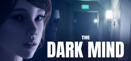
The Dark Mind scored 70/100 on Steam Analyzer — Good for a Hidden Object capsule. Top priority fix: [uniqueness_polish] Introduce a distinctive visual signature—such as a signature motif, signature lighting effect, or unique UI element—that differentiates the capsule from standard psychological horror competitors and signals the core 'hallucination-navigation' mechanic.

Capsule scores by dimension

  • Genre Clarity: 7/10 — Psychological thriller with action undertones. The close-up face with pained/confused expression and institutional setting (EXIT sign, harsh lighting) clearly signals psychological horror or thriller genre. The muted purple-blue color palette and claustrophobic composition suggest mental distress rather than combat-focused action. At TINY size, the haunted facial expression and institutional environment remain the dominant read, though the action element is less apparent.
  • Title Readability: 8/10 — Bold white sans-serif, excellent contrast. THE DARK MIND uses large, all-caps white sans-serif text positioned against a darker right-side background region, ensuring strong legibility at all sizes. The text does not overlap noisy character detail and maintains clean letterform spacing. At TINY size (120×45), the title remains clearly readable with good separation from the background figure.
  • Contrast & Color: 8/10 — Strong value separation, moody cohesion. The bright white title and the character's pale face create sharp value contrast against the dark institutional background and Steam's #1b2838 color. Cool blue-purple tones dominate and enhance the psychological dread mood without muddiness. In grayscale, the silhouette of the face and EXIT sign remain distinct, though the overall design relies on cool mid-tones that compress slightly at tiny scale but do not collapse.
  • Uniqueness & Polish: 6/10 — Competent psychological horror presentation. The image uses recognizable psychological thriller cues—close-up anguished face, institutional setting, moody lighting—without a distinctive visual hook that sets it apart from similar indie horror releases. The rendering quality is solid and professional, but the composition and color grading follow familiar horror genre conventions seen in comparable titles like Hellblade II. This feels polished but not creatively daring or memorable in the context of top-tier indie action releases.
  • Brand Consistency: 6/10 — Thematic consistency, minimal character identity. The capsule consistently conveys psychological distress and institutional horror, which aligns with the game's premise of navigating Jessica's hallucinations. However, without reference to the 10 screenshots, the character's face lacks iconic or memorable branding—it reads as a generic distressed protagonist rather than a distinctive character identity that would anchor the brand. The moody institutional aesthetic is internally coherent but generic within the horror indie space.
  • Composition: 7/10 — Clear focal point, intentional layout. The character's face occupies the left third as the primary subject, while the title anchors the right side with institutional background elements (EXIT sign, lighting fixtures) creating depth layers. The composition guides the eye effectively and avoids clutter, though the lower half of the image becomes slightly empty and unfocused. At SMALL size, the focal hierarchy holds; at TINY, the title remains prominent but supporting elements (EXIT sign, fixtures) fade into the background noise.

What works

  • Strong title contrast and legibility. White bold sans-serif text reads clearly at all sizes against controlled darker background regions, ensuring discoverability in Steam browsing.
  • Cohesive psychological horror mood. Cool color palette, institutional setting, and pained expression work together to reinforce the game's mental distress narrative without contradictory signals.
  • Clear focal point with good depth. Character face (left) and title (right) create natural viewing hierarchy with background environment supporting rather than competing for attention.

What hurts the capsule

  • Generic horror presentation. The psychological thriller aesthetic uses familiar conventions without a distinctive visual hook that differentiates it from competitor titles like Hellblade II or Dredge.
  • Limited character brand identity. Jessica's face, while emotionally expressive, lacks iconic or memorable design that signals a recognizable protagonist across marketing touchpoints.
  • Lower composition void. The bottom half of the image features unfocused institutional background with no secondary focal point, leaving prime real estate visually inert.

Priority fixes

  1. [uniqueness_polish] Introduce a distinctive visual signature—such as a signature motif, signature lighting effect, or unique UI element—that differentiates the capsule from standard psychological horror competitors and signals the core 'hallucination-navigation' mechanic.
  2. [brand_consistency] Refine the character design or expression to feel more iconic and recognizable; consider adding a subtle visual marker or styling choice that makes Jessica's face memorable across all marketing assets.
  3. [composition] Extend the focal interest into the lower half of the composition with a secondary detail (distorted environment element, visual glitch, or thematic prop) that reinforces the hallucination premise without cluttering the primary title area.

Store copy priority fixes

  1. [hook_strength] Replace 'Carefully observe your surroundings' with an active, emotive verb: 'Escape Jessica's nightmares by spotting what shouldn't be there' to create urgency and immediate intrigue.
  2. [tone_match] Remove the closing 'and don't be scared! :)' and replace with a single, consistent tone line that matches the gore and psychological horror tags, e.g., 'A relentless descent into obsession.'
  3. [feature_communication] Expand the LEVELS section with one-sentence descriptions of each location's theme and observational difficulty, e.g., 'The Hospital — distorted memories where medical instruments shift between reality and nightmare.'
  4. [uniqueness] Add a sentence that differentiates this game, e.g., 'Unlike traditional hidden-object games, every difference reveals a fragment of Jessica's fractured mind' or specify what makes the hallucination mechanic distinct.

Related guides

Steam app ID: 2816410 · Tags: Hidden Object, First-Person, Gore, Action, Indie