Scoring genre clarity...

The Silent Forests capsule

The Silent Forests

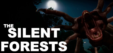
🏠 Embark on a captivating journey through the Silent Forests, treacherous sewers, and a mysterious house. Solve puzzles, face monsters, and unravel hidden truths in this adrenaline-packed adventure with a wacky narrator! 🌲🚪✨

$8.993 user reviews
ActionAdventureHorror
ABMKF StudioMay 1, 2025

The Silent Forests scores 68/100 — better than 17% of Action capsules (n=8,534).

3 user reviews · $8.99 · Released May 1, 2025 · By ABMKF Studio

Quick text summary

The Silent Forests scored 68/100 on Steam Analyzer — Solid for a Action capsule. Top priority fix: [brand_consistency] Introduce a distinctive visual motif or iconic creature design element that would be immediately recognizable across all marketing materials and screenshots.

Capsule scores by dimension

  • Genre Clarity: 7/10 — Horror-adventure with dark atmosphere. The grotesque creature silhouette, moonlit forest setting, and ominous tone clearly signal a horror or dark adventure game. At TINY size, the twisted organic form and eerie lighting still read as something unsettling and genre-appropriate. However, the "wacky narrator" comedic element is completely invisible from the imagery, creating slight genre ambiguity between straight horror and horror-comedy.
  • Title Readability: 8/10 — Bold, clear sans-serif positioned left. "THE SILENT FORESTS" uses strong white sans-serif typography with excellent contrast against the dark background, positioned on the left third where there is minimal visual noise. The title remains fully legible at SMALL and TINY sizes due to the thick letterforms and clean outline against the sky. No tagline or subtitle clutter aids readability.
  • Contrast & Color: 8/10 — Strong value separation, silhouette reads. The white title text pops sharply against the dark teal-blue sky, and the warm reddish-brown creature contrasts distinctly from the cool background palette. At TINY size, the silhouette of the twisted creature and moonlit sky create clear separation; a grayscale test confirms strong value differentiation throughout. The lighting setup (rim-lit branches, bright moon) enhances layered depth.
  • Uniqueness & Polish: 6/10 — Competent atmospheric craft, generic execution. The twisted creature and moonlit forest establish a clear horror mood and visual hook, but the composition and execution feel like a standard indie horror capsule template rather than distinctly memorable. The creature design is grotesque but not particularly iconic, and the overall aesthetic aligns closely with many other dark adventure titles without a signature stylistic flourish. Compared to top-tier indie capsules like DREDGE or Slay the Princess, this lacks a memorable identity cue or distinctive art direction.
  • Brand Consistency: 5/10 — Limited memorable identity signals. The dark forest and twisted creature are thematically coherent with the game's description but offer no iconic symbol, character, or signature palette that would be instantly recognizable across future marketing. Without access to internal knowledge of the other 7 screenshots, the capsule reads as a generic dark-woods horror image rather than something with a strong brand imprint. The wacky narrator element is completely absent from visual language.
  • Composition: 7/10 — Clear focal point, safe margins respected. The twisted creature occupies center-right space as the primary focal point while the title anchors the left side, creating good balance and visual hierarchy. The composition is well-layered with sky backdrop, moon light source, and creature in foreground; important elements avoid hard edges where Steam cropping might cut them off. At TINY size, the title and creature silhouette both remain clearly readable, though the creature's fine details blur slightly.

What works

  • High title contrast and legibility. Bold white sans-serif remains fully readable at all sizes from FULL down to TINY, with excellent pop against the dark background.
  • Clear atmospheric mood and genre signal. The moonlit forest, grotesque creature, and eerie lighting immediately communicate a dark horror-adventure tone appropriate to the game's premise.
  • Balanced composition with safe margins. Title and creature are well-positioned across the frame without hugging edges, ensuring resilience to Steam cropping and viewing at multiple sizes.

What hurts the capsule

  • No iconic brand identity element. The twisted creature and forest setting are generic enough to match dozens of other indie horror games; there is no signature motif or character that makes it immediately recognizable.
  • Wacky narrator tone is invisible. The game description emphasizes comedic storytelling with a wacky narrator, but the capsule image communicates only straightforward horror with no visual levity or humor cues.
  • Generic creature design lacks distinction. While grotesque and unsettling, the twisted form is not unique enough to stand out from similar dark-fantasy creature imagery in the genre.

Priority fixes

  1. [brand_consistency] Introduce a distinctive visual motif or iconic creature design element that would be immediately recognizable across all marketing materials and screenshots.
  2. [uniqueness_polish] Incorporate a subtle visual hint of the comedic tone (e.g., an unusual prop, expression, or detail) that signals the "wacky narrator" personality without diluting the atmospheric mood.
  3. [composition] Add a secondary focal point or supporting element in the mid-ground that reinforces the game's core mechanic (puzzle-solving, monster encounters, or house exploration) to strengthen visual storytelling.

Store copy priority fixes

  1. [hook_strength] Replace 'Embark on a captivating journey' with a verb-driven hook that reveals the core conflict—e.g., 'Trapped in the Silent Forests with only a wacky guide and your wits, solve deadly puzzles or become the monsters' next meal.'
  2. [tone_match] Clarify whether this is horror-comedy or straight horror by either emphasizing psychological dread in the short description or moving humor to a secondary tone; the current 50/50 split creates confusion.
  3. [feature_communication] Add a sentence explaining how the narrator interacts with gameplay—does he provide hints, mock the player, break the fourth wall? This is your unique hook and it needs concrete detail.
  4. [uniqueness] Rewrite the 'Key Features' section to highlight what differentiates this game; compare it to a comp title if needed (e.g., 'Combines the escape-room puzzle design of Portal with the narrative commentary style of The Stanley Parable').

Related guides

Steam app ID: 2822080 · Tags: Action, Adventure, Horror, Puzzle, Psychological Horror