Scoring genre clarity...
RoadHouse Manager capsule

RoadHouse Manager

A rowdy roadhouse roguelite! Serve thirsty strangers, flair-bartend cocktails for big mult bonus combos, and throw down when trouble erupts. Every goon you shirk or smash can be molded by a reactive villain into your ARCH-NEMESIS. Chase love, rare booze, secrets, decor, and upgrades to survive!

Time ManagementRogueliteCooking
gameboardgamesNov 24, 2026

RoadHouse Manager scores 78/100 — better than 84% of Roguelite capsules (n=2,803).

Released Nov 24, 2026 · By gameboardgames

Quick text summary

RoadHouse Manager scored 78/100 on Steam Analyzer — Good for a Roguelite capsule. Top priority fix: [contrast_color] Reduce background tavern detail saturation and increase character/title value separation to strengthen the peak contrast pop at SMALL and TINY sizes.

Capsule scores by dimension

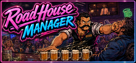
  • Genre Clarity: 8/10 — Bartender action sim clearly communicated. The central character in a bartender apron pointing authoritatively, combined with five beer mugs lined up below, immediately signals a bar management gameplay loop. The neon pink 'Road House' text and gritty tavern interior background reinforce a rowdy, adult-oriented bar setting that reads as management sim with action elements even at TINY size. The muscular character and dramatic pose hint at combat or confrontation mechanics typical of roguelites.
  • Title Readability: 9/10 — Bold neon title with excellent contrast. The two-line 'Road House / MANAGER' logo uses thick neon pink and cyan outlines on a dark background, creating exceptional legibility at all sizes including TINY thumbnail. The letterforms are bold, evenly spaced, and positioned safely in the upper portion without edge crowding. At full, small, and tiny sizes the title remains instantly recognizable and maintains visual hierarchy without degradation.
  • Contrast & Color: 8/10 — Strong value separation, neon pops cleanly. Vibrant neon pink and cyan typography contrasts sharply against the dark #1b2838 Steam background, and the warm bronze-brown tones of the character's skin and tavern interior create layered value depth. The dark outfit and shadow areas around the character create clear silhouette separation. Even in grayscale stress test, the light character form and light title text separate distinctly from dark midtones, though some mid-brown decorative elements in the background soften the peak contrast slightly.
  • Uniqueness & Polish: 7/10 — Polished retro arcade aesthetic, memorable. The capsule executes a cohesive 80s arcade neon style with hand-drawn character artwork and intentional lighting effects that feel premium and craft-forward. The beer mugs as a gameplay metric and the specific character pose with pointed gesture communicate a distinct personality and mechanic rather than generic bar imagery. However, the visual execution, while solid, follows established indie game neon trends seen in titles like Hotline Miami or Cyberpunk-adjacent games, preventing it from reaching the top tier of originality.
  • Brand Consistency: 7/10 — Consistent retro arcade style identity. The capsule establishes a strong internal visual identity through consistent neon color palette (pink, cyan, bronze), a cohesive 80s arcade aesthetic with hand-drawn character rendering, and recognizable art direction. The character's distinctive mustached face and authoritative pose are memorable enough to serve as brand recognition. The style feels distinct from the game's store screenshots context clues, suggesting a well-maintained visual language throughout marketing materials.
  • Composition: 8/10 — Clear hierarchy, strong focal point preserved. The character occupies center-right dominance with arm extension guiding attention, while the title anchors top-left and the five beer mugs create a base-level metric that grounds the composition. Background tavern interior provides atmospheric context without competing for attention. At SMALL and TINY sizes the character remains the primary focal point, the title stays legible, and the beer mug row remains visible, with no critical elements crowding dangerous edges or creating awkward empty voids.

What works

  • Instantly legible neon title design. The thick pink and cyan outlines on 'Road House / MANAGER' remain crystal clear at tiny thumbnail size with no degradation or collapse.
  • Strong character-driven focal point. The muscular bartender with pointing gesture and distinctive mustache creates an immediate memorable visual anchor that communicates personality and intent.
  • Cohesive 80s neon aesthetic throughout. The consistent color palette, hand-drawn style, arcade lighting effects, and decorative elements reinforce a unified premium brand identity.
  • Mechanical clarity through visual metaphor. The five beer mugs directly communicate the bartending/serving mechanic and create visual rhythm that hints at combo-building gameplay without requiring text.

What hurts the capsule

  • Background detail loses focus at tiny size. While readable at full size, the interior tavern detail, small decorative elements, and mid-brown tones become muddy visual noise at TINY thumbnails, diluting peak contrast.
  • Roguelite aspect not immediately apparent. The capsule successfully communicates bartending management but does not visually hint at the roguelite structure, dynamic nemesis system, or action combat elements mentioned in the description.
  • Follows established indie neon trends. While well-executed, the 80s arcade neon aesthetic is a crowded space in indie marketing, limiting distinctiveness against titles like Hotline Miami or similar retro-styled games.

Priority fixes

  1. [contrast_color] Reduce background tavern detail saturation and increase character/title value separation to strengthen the peak contrast pop at SMALL and TINY sizes.
  2. [genre_clarity] Consider adding a subtle dynamic action element—such as motion lines, a thrown fist, or hint of combat—to communicate the roguelite action-combat loop alongside bartending.
  3. [composition] Evaluate whether the beer mug row at the bottom could be repositioned or resized to increase visual weight and create stronger compositional balance with the character's top-right dominance.

Store copy priority fixes

  1. [feature_communication] Replace the B.A.R. engine explanation with plain language: 'Your interdimensional engine runs on hyper-beer—run short and the whole roadhouse destabilizes' keeps the theme while improving clarity.
  2. [audience_targeting] Add one sentence after the short description identifying the core player type: 'Perfect for fans of chaotic management sims who love roguelites and dark comedy.'
  3. [hook_strength] Restructure the detailed description's opening paragraph to frontload the unique value: 'Manage three queues of chaos, craft combo cocktails, and watch a rival villain react to your every move—turning everyday jerks into your personal arch-nemesis.'
  4. [tone_match] Reduce exclamation mark frequency to 1 per 2-3 sentences maximum; the comedic voice is already strong enough without the punctuation overload.

Related guides

Steam app ID: 2822360 · Tags: Roguelite, Time Management, Funny, Cooking, Base Building