Scoring genre clarity...

Apocalyptic Shadow capsule

Apocalyptic Shadow

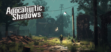
This game is set in a fictional post-apocalyptic Western Europe. They must use their wits and skills to survive in dangerous environments. On the road of adventure, players will encounter thrilling moments and feel an unparalleled tension and sense of accomplishment.

$2.99Positive(15)
AdventureShooterTop-Down Shooter
EasternDRDec 12, 2025

Apocalyptic Shadow scores 73/100 — better than 61% of Adventure capsules (n=7,922).

Positive (15 reviews) · $2.99 · Released Dec 12, 2025 · By EasternDR

Quick text summary

Apocalyptic Shadow scored 73/100 on Steam Analyzer — Good for a Adventure capsule. Top priority fix: [brand_consistency] Introduce a distinctive character silhouette or iconic symbol (weapon, armor detail, or distinctive pose) that becomes a visual signature recognizable across future promotional materials.

Capsule scores by dimension

  • Genre Clarity: 8/10 — Post-apocalyptic survival clearly signaled. The desolate overgrown environment with abandoned structures, power lines, and a solitary figure in a wasteland immediately communicates post-apocalyptic adventure. Rusted metal, dead trees, and decay iconography are unmistakable at full size and remain legible at small size, though the silhouette of the player character is the key readable element at tiny size that anchors the survival-adventure genre.
  • Title Readability: 8/10 — Title reads cleanly at all sizes. The white sans-serif title 'Apocalyptic Shadows' is positioned in the top-left with a subtle shadow outline that provides strong separation from the murky teal background. At full size it is crisp and prominent; at small and tiny sizes it remains legible due to high contrast and simple geometric letterforms, though the second line loses minor clarity at extreme reduction.
  • Contrast & Color: 7/10 — Moody teal palette with accent highlights. The cool teal-green gradient background establishes strong atmospheric mood and separates well from the Steam dark background. The warm golden-yellow ambient glow around the player character and distant structures creates effective value contrast and draws focus; however, the mid-tone greens in the foliage blend somewhat into the teal sky at tiny size, slightly reducing silhouette clarity in grayscale test.
  • Uniqueness & Polish: 7/10 — Atmospheric post-apocalyptic scene well-rendered. The composition demonstrates solid craft with layered depth, environmental storytelling through decay and abandonment, and a cohesive art direction that communicates the game's core tension and solitary survival theme. The lighting treatment and weathered aesthetic feel intentional and premium, though the overgrown wasteland is a familiar visual trope in indie games; the execution is polished rather than groundbreaking.
  • Brand Consistency: 6/10 — Competent thematic consistency, limited icon. The capsule maintains internal cohesion with a unified color palette, consistent rendering style, and clear post-apocalyptic art direction aligned with survival-adventure expectations. However, there is no distinctive character icon, signature motif, or memorable visual symbol that would allow the brand to stand out from other dystopian indie titles at future encounters.
  • Composition: 8/10 — Strong focal hierarchy and balanced depth. The lone figure in mid-ground serves as the primary focal point with clear layering: foreground decay and structures, midground character, and atmospheric background establishing depth. Title placement in top-left respects safe margins and does not compete with the visual center, and the composition remains cohesive and readable across small and tiny sizes without critical crop vulnerability.

What works

  • High-contrast title placement. White serif-outlined text in top-left corner maintains legibility from full size through tiny thumbnail due to strong value separation and simple letterforms.
  • Atmospheric environmental storytelling. Overgrown ruins, power lines, and decay communicate post-apocalyptic survival theme and core tension without requiring readable text or UI elements.
  • Effective focal point with depth layering. The solitary player character in golden ambient light anchors attention in the mid-ground, with clear foreground and background separation creating visual hierarchy.
  • Mood cohesion through teal color palette. Consistent cool-toned atmosphere establishes emotional tone and separates well from Steam's dark background throughout all viewing sizes.

What hurts the capsule

  • Limited brand identity and distinctiveness. No iconic character, symbol, or signature visual motif differentiates this capsule from other post-apocalyptic indie games in the crowded genre.
  • Foliage detail blends at small sizes. Mid-tone green vegetation merges into the teal background in grayscale test at tiny size, reducing silhouette clarity and environmental readability.
  • Generic wasteland archetype. The overgrown ruins and lone survivor premise, while well-executed, follow familiar post-apocalyptic visual conventions without a unique hook.

Priority fixes

  1. [brand_consistency] Introduce a distinctive character silhouette or iconic symbol (weapon, armor detail, or distinctive pose) that becomes a visual signature recognizable across future promotional materials.
  2. [contrast_color] Increase saturation or value separation of foreground foliage and immediate structures to prevent mid-tone blending into the teal background at small and tiny sizes.
  3. [uniqueness_polish] Emphasize a unique selling point through environmental detail (e.g., unique Western European architecture, specific catastrophe marker, or distinctive technology) to differentiate from generic post-apocalyptic competitors.

Store copy priority fixes

  1. [hook_strength] Replace 'This game is set in a fictional post-apocalyptic Western Europe' with an action verb and core hook: 'Scavenge, survive, and escape the irradiated wastelands of post-apocalyptic Europe—but fail and lose everything.' This immediately communicates gameplay and stakes.
  2. [uniqueness] Expand the mention of mutated zombies into a clear differentiator: explain how radiation effects create unique enemy behaviors or environmental hazards that set this apart from standard zombie survival, or add another concrete mechanical twist (e.g., 'base construction,' 'faction mechanics').
  3. [audience_targeting] Add a sentence early in the detailed description that signals the intended player type, such as: 'Perfect for permadeath survival fans seeking high-risk expeditions' or 'For players who thrive on exploration and discovery in hostile worlds.'
  4. [tone_match] Standardize tone throughout the detailed description; either commit to dark, gritty survival messaging or lean into action-fantasy power, but do not alternate between them—consistency will strengthen immersion and trust.

Related guides

Steam app ID: 2829290 · Tags: Adventure, Shooter, Top-Down Shooter, 2D, Survival