Scoring genre clarity...

Crab Attack capsule

Crab Attack

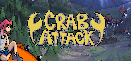
Hop on a flying crab and go on an adventure that blends exploring intricate branching stages with blistering shoot 'em up action. Gather upgrade materials, escape with the goods, discover hidden areas, and take down 15 unique bosses to save Crater City.

$11.999 user reviews
Bullet HellShoot 'Em UpMetroidvania
Crab Attack GamesJul 11, 2025

Crab Attack scores 72/100 — better than 42% of Bullet Hell capsules (n=1,285).

9 user reviews · $11.99 · Released Jul 11, 2025 · By Crab Attack Games

Quick text summary

Crab Attack scored 72/100 on Steam Analyzer — Good for a Bullet Hell capsule. Top priority fix: [uniqueness_polish] Add a dynamic action pose or combat visual element (e.g., character firing weapon, crab in mid-flight with motion blur, or enemy silhouettes) to telegraph the shooter component and differentiate from passive exploration capsules.

Capsule scores by dimension

  • Genre Clarity: 7/10 — Clear action adventure with quirky hook. The flying crab protagonist and vibrant fantasy landscape immediately signal action-adventure gameplay with a comedic or whimsical tone. At tiny size, the bold yellow 'CRAB ATTACK' title and the orange crab silhouette remain recognizable, though the specific shoot 'em up blend is less obvious without the UI hints visible at full size. The red-haired character and landscape suggest exploration and adventure clearly.
  • Title Readability: 8/10 — Strong title with excellent visibility. The 'CRAB ATTACK' logo uses a bold yellow outline with black fill against the purple sky, creating excellent contrast that holds at small and tiny sizes. The letterforms are chunky and legible even at thumbnail scale, and the placement in the upper-center region avoids cluttered background elements. The title does not collapse under squint or grayscale tests due to strong value separation.
  • Contrast & Color: 8/10 — Vibrant palette with strong silhouettes. The yellow title, orange crab, red character hair, and purple-to-green landscape gradient create excellent value separation against the dark Steam background. The foreground character and crab are well-isolated from the misty valley background, and warm colors pop effectively in quick scroll conditions. Grayscale test shows clear dark-to-light hierarchy with the crab and title remaining distinct.
  • Uniqueness & Polish: 7/10 — Charming indie aesthetic, somewhat template. The painted landscape and character art display solid craft and a cohesive indie aesthetic that feels intentional and polished, not cheap. However, the composition—protagonist on foreground object with expansive scenic background—is a common indie capsule template used across many adventure titles. The quirky flying crab hook is memorable, but the overall visual execution, while clean, does not stand out against top-tier indie capsules like Sea of Stars or DREDGE that feature more distinctive art direction.
  • Brand Consistency: 6/10 — Consistent art style, weak identity. The painted 2D character art, watercolor landscape, and color palette are internally cohesive and consistent with typical indie adventure branding. However, there are no strong iconic visual motifs, signature colors, or memorable symbols that would make this capsule immediately recognizable as 'Crab Attack' if the logo were removed. The design relies on the title rather than a distinctive visual identity or character silhouette.
  • Composition: 7/10 — Clear focal point, safe layout. The left-anchored character and orange crab create a strong foreground focal point, with the landscape receding into depth and the title positioned clearly in the upper-center. At small and tiny sizes, the character-crab unit remains the primary visual anchor without competing clutter. The composition is balanced and leaves safe margins, though the vast background landscape could be seen as slightly passive and does not reinforce the shoot 'em up or boss-battle elements hinted at in the description.

What works

  • Bold, legible title design. The yellow 'CRAB ATTACK' wordmark with black outline maintains clarity and pop at all viewing sizes, including tiny thumbnails.
  • Strong color contrast and saturation. Warm oranges, reds, and yellows on a purple-to-green gradient ensure excellent visual separation against the dark Steam background in quick-scroll scenarios.
  • Clear focal point hierarchy. The foreground character and crab immediately draw the eye, with the landscape supporting rather than competing for attention.

What hurts the capsule

  • Generic indie adventure template. The composition of a colorful character on a scenic landscape is a common pattern that does not distinguish this capsule from dozens of other indie titles in the genre.
  • Weak brand identity without logo. No iconic character design, signature visual motif, or distinctive palette element would allow recognition if the title were removed.
  • Action gameplay not visually emphasized. The peaceful landscape and static character pose do not communicate the shoot 'em up intensity, boss battles, or dynamic gameplay loops mentioned in the description.

Priority fixes

  1. [uniqueness_polish] Add a dynamic action pose or combat visual element (e.g., character firing weapon, crab in mid-flight with motion blur, or enemy silhouettes) to telegraph the shooter component and differentiate from passive exploration capsules.
  2. [genre_clarity] Include subtle UI elements, energy effects, or enemy hints in the landscape to reinforce the 'blistering shoot 'em up' blend and boss-battle theme at full size without cluttering tiny previews.
  3. [brand_consistency] Develop a signature visual motif or color accent (e.g., glowing energy aura around the crab, unique weapon design, or recurring symbol) that could serve as a recognizable brand mark independent of the title.

Store copy priority fixes

  1. [audience_targeting] Add a sentence clarifying whether the game is forgiving enough for exploration-focused players or demands shmup mastery; mention accessibility features like pause-play or difficulty options to broaden appeal.
  2. [feature_communication] Expand the Conquer section to explain what happens after defeating bosses—are there harder difficulty tiers, new weapon combos to unlock, or post-game content? This closes a gap in the progression narrative.
  3. [uniqueness] Add one sentence explicitly comparing the blend to other genre hybrids ('unlike pure Metroidvanias, every stage demands shoot 'em up reflexes') to differentiate from Hollow Knight or Ikaruga clones.

Related guides

Steam app ID: 2831900 · Tags: Bullet Hell, Shoot 'Em Up, Metroidvania, Exploration, Adventure