Scoring genre clarity...

Vyun, Kosmeya, And The Witch’s Curse capsule

Vyun, Kosmeya, And The Witch’s Curse

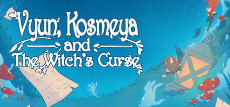
A linear visual novel that tells us about the adventures of a budding writer, Kosmeya, who needs to take his manuscript to a competition in the capital, the path to which passes through a creepy forest.

$2.992 user reviews
AdventureCasualVisual Novel
DillyFrameNov 3, 2025

Vyun, Kosmeya, And The Witch’s Curse scores 73/100 — better than 61% of Adventure capsules (n=7,922).

2 user reviews · $2.99 · Released Nov 3, 2025 · By DillyFrame

Quick text summary

Vyun, Kosmeya, And The Witch’s Curse scored 73/100 on Steam Analyzer — Good for a Adventure capsule. Top priority fix: [title_readability] Add a subtle text outline or shadow to the decorative script to preserve letterform definition at tiny sizes while maintaining elegance.

Capsule scores by dimension

  • Genre Clarity: 7/10 — Storybook adventure with whimsy. The illustrated art style, decorative typography, and whimsical character silhouettes (writer figure, witch elements) clearly signal a narrative-driven casual adventure. At tiny size, the ornate script and fantastical visual palette remain readable enough to suggest story-heavy gameplay, though genre specificity is softened by the casual, fairy-tale aesthetic rather than emphasizing linear visual novel mechanics.
  • Title Readability: 8/10 — Ornate script, readable hierarchy. The title uses a decorative serif script with consistent white letterforms set against the bright turquoise background. Hierarchy is clear: 'Vyun, Kosmeya' emphasizes the protagonists, with 'and The Witch's Curse' as secondary text. At small size the main characters' names remain legible, though at tiny size the decorative flourishes blur slightly, but the overall title shape is still recognizable due to strong contrast and strategic spacing.
  • Contrast & Color: 8/10 — Bright turquoise pop, strong separation. The warm turquoise-to-cyan gradient background provides excellent value separation from white and cream text and warm orange/red accent elements. Silhouettes of characters and objects are crisp and defined, and the color palette avoids muddy mid-tones. Against the dark Steam background #1b2838, the entire capsule pops immediately with clear internal contrast hierarchy.
  • Uniqueness & Polish: 7/10 — Charming storybook aesthetic, craft evident. The hand-drawn illustrative style and whimsical composition communicate a premium indie narrative game with clear artistic intent. Character silhouettes, decorative leaf motifs, and the manuscript/quill visual storytelling hint at the writer-protagonist core mechanic. However, the overall execution, while polished, follows recognizable indie visual novel conventions rather than breaking new ground; it reads as competent and appealing rather than immediately distinctive.
  • Brand Consistency: 7/10 — Cohesive storybook style identity. The capsule establishes a consistent art direction: decorative script, illustrative character work, warm-cool color palette, and fairy-tale visual language. These cues would form a recognizable brand identity across store screenshots and marketing. The style is internally coherent and memorable, though not anchored by a single iconic character or symbol that would make recognition instantaneous.
  • Composition: 7/10 — Clear focal hierarchy, balanced layout. The title anchors the upper third with strong visual weight, while character and environmental elements are distributed across the mid and lower areas, creating depth layering. The composition avoids dead center voids and uses safe margins effectively. At small and tiny sizes, the main focal point (title plus silhouettes) remains clear, though some smaller decorative elements (leaves, distant trees) lose definition and could risk feeling cluttered if the image were more complex.

What works

  • Excellent color contrast against dark Steam background. Turquoise gradient and warm accents create immediate visual separation and pop that draws attention at any size.
  • Readable, character-forward title hierarchy. White decorative script for protagonist names is clearly emphasized, with supporting subtitle properly de-emphasized, maintaining legibility at small sizes.
  • Cohesive storybook art direction. Illustration style, typography, and color palette work together to establish a distinctive, premium indie aesthetic.

What hurts the capsule

  • Decorative script loses fine detail at tiny size. While overall readable, the serif flourishes and ornamental letterforms blur at very small sizes, risking loss of elegance.
  • Genre specificity softened by whimsy. The casual storybook aesthetic obscures that this is specifically a linear visual novel, which may confuse browsers expecting interactive adventure mechanics.
  • Secondary title placement competing for attention. The 'and The Witch's Curse' line, while hierarchically lower, still occupies central space and could benefit from tighter vertical compression to reduce visual weight.

Priority fixes

  1. [title_readability] Add a subtle text outline or shadow to the decorative script to preserve letterform definition at tiny sizes while maintaining elegance.
  2. [genre_clarity] Consider a small visual indicator (e.g., manuscript icon, book motif in corner) to signal 'visual novel' more explicitly without disrupting composition.
  3. [composition] Compress vertical spacing between title lines slightly to tighten the focal point and reduce overall capsule height pressure at small sizes.

Store copy priority fixes

  1. [hook_strength] Rewrite the short description to lead with an active, evocative verb: 'Guide Kosmeya through a cursed forest to reach the writing competition of his dreams—if the witch's curse doesn't stop him first' rather than the passive 'tells us about' framing.
  2. [uniqueness] Add a sentence in the detailed description that articulates one specific, concrete differentiator—e.g., a detail about the witch character, the world, or how the hidden object puzzles integrate into the story, rather than treating them as generic mini-games.
  3. [feature_communication] Expand the Features section with brief, concrete descriptions: instead of just 'hidden object game,' explain 'Solve hand-drawn hidden object puzzles woven into story scenes' to help players understand what gameplay feels like.
  4. [audience_targeting] Add one explicit sentence signaling the intended audience, such as 'Perfect for players seeking a relaxing, story-driven adventure' or 'Ideal for families and puzzle enthusiasts' to clarify who this game serves.

Related guides

Steam app ID: 2836660 · Tags: Adventure, Casual, Visual Novel, Hidden Object, Family Friendly