Scoring genre clarity...
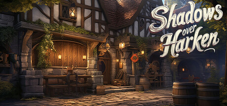
Welcome to Shadows over Harken, where a necromancer threatens to corrupt the peaceful village of Harken. Join our team of heroes: Relic, Alessia, Hiligon, Klean and Neville. Experience an immersive visual novel that combines deep storytelling with combat mechanics, where your choices shape the land.
$2.991 user reviews
AdventureCasualRPG
Loyalty GamesOct 1, 2025