Scoring genre clarity...

Lost in Prayer capsule

Lost in Prayer

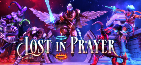
Solve intricate tactical challenges to escape purgatory —through Hell or Heaven — or die trying. When you die (and you will), you unlock a new creature, with a unique skill set and multiple playstyles to master. The challenge is to survive, yet the reward lies in dying

$19.99Very Positive(93)
3DStylizedDark
Nine Dots StudioJul 15, 2025

Lost in Prayer scores 72/100 — better than 46% of 3D capsules (n=7,782).

Very Positive (93 reviews) · $19.99 · Released Jul 15, 2025 · By Nine Dots Studio

Quick text summary

Lost in Prayer scored 72/100 on Steam Analyzer — Good for a 3D capsule. Top priority fix: [genre_clarity] Add subtle roguelike or purgatory-specific visual cue—such as a ghostly aura, divine/infernal aura split, or numeric UI element hinting at meta-progression—to communicate the core mechanic.

Capsule scores by dimension

  • Genre Clarity: 7/10 — Fantasy RPG with tactical hints. The composition clearly telegraphs a fantasy RPG through multiple armed characters in elaborate armor and magical gear arranged in a battle-ready formation against a cosmic backdrop. At TINY size, the silhouettes of winged and armored figures remain readable and suggest combat-focused gameplay, though the roguelike/tactical depth is not immediately obvious without additional context. The neon glow and particle effects reinforce a stylized action-fantasy tone rather than pure strategy.
  • Title Readability: 8/10 — Clear centered title with strong outline. The title 'LOST IN PRAYER' uses a bold serif font with a white outline and semi-transparent backing that maintains excellent contrast against both the dark space and the glowing character area. At SMALL size (231x87), the text remains fully legible without collapse, and the centered placement on a relatively controlled gradient region prevents clipping. At TINY size (120x45), letterforms remain distinct enough to identify the title, though fine serifs soften slightly.
  • Contrast & Color: 8/10 — Vibrant neon palette with strong separation. The design uses saturated magenta, cyan, and orange neon tones that create excellent value separation against the dark blue-purple background (#1b2838 simulation). Characters are lit from within with glowing accents and silhouettes that read clearly even when squinting; the grayscale silhouette test confirms distinct shapes and edges. The only minor weakness is some mid-tone muddiness in the lower-left character area where reds and purples blend slightly.
  • Uniqueness & Polish: 7/10 — Polished neon-fantasy style, lacks mechanic clarity. The capsule demonstrates strong technical craft with coherent lighting, particle effects, and character rendering that feels premium compared to generic RPG templates. However, the visual does not communicate the core roguelike mechanic (dying unlocks new creatures) or the purgatory/Heaven-or-Hell narrative hook—it reads as a standard fantasy battle scene rather than something mechanically distinctive. The neon aesthetic is striking but increasingly common in indie marketing.
  • Brand Consistency: 6/10 — Coherent visual style, limited identity markers. The image maintains internal consistency across rendering, color grading, and lighting direction, creating a unified neon-fantasy aesthetic that could be recognized as belonging to this game. However, there are no obvious iconic characters, symbols, or signature motifs that would make this capsule instantly memorable or distinguishable from other stylized tactical RPGs in a quick scroll context. The brand identity relies on execution quality rather than a distinctive hook or mascot.
  • Composition: 7/10 — Strong focal hierarchy, balanced staging. The composition arranges three major character units with clear depth layering—winged warrior center-high, mechanical characters flanking left and right, creating a triangular hierarchy that guides the eye naturally. The title placement at bottom-center uses negative space effectively without crowding focal elements. At SMALL size, the arrangement remains readable; at TINY size, the silhouette hierarchy holds but fine details blur, which is acceptable for a neon-heavy design.

What works

  • Bold, readable title treatment. White outlined serif text with backing holds legibility from FULL down to TINY size without losing letterform clarity or collapsing.
  • Strong neon color separation. Saturated magenta, cyan, and orange accents create excellent value contrast against the dark background in grayscale and color contexts.
  • Clear character silhouette hierarchy. Three distinct figures with different poses and lighting create depth and guide the eye naturally across the composition at all viewing sizes.
  • Premium render quality and polish. Consistent lighting, particle effects, and material rendering convey high production values and a cohesive art direction.

What hurts the capsule

  • Mechanic clarity absent from visuals. The roguelike death-unlock system and purgatory narrative are not visually communicated; it reads as a generic fantasy battle rather than a distinctive game hook.
  • Limited brand identity markers. No iconic character, symbol, or signature visual element that would make this capsule instantly recognizable in a scrolling store context.
  • Mid-tone color blend in background figures. Lower-left character area shows some muddiness where reds and purples overlap, slightly reducing silhouette clarity at TINY size.
  • Generic neon-fantasy aesthetic. While well-executed, the visual style is increasingly common in indie and AA tactical RPG marketing, limiting differentiation.

Priority fixes

  1. [genre_clarity] Add subtle roguelike or purgatory-specific visual cue—such as a ghostly aura, divine/infernal aura split, or numeric UI element hinting at meta-progression—to communicate the core mechanic.
  2. [uniqueness_polish] Develop or emphasize a signature character, motif, or color accent unique to Lost in Prayer that differentiates it from other neon-fantasy RPGs and builds brand memory.
  3. [composition] Review the lower-left character silhouette and separate reds/purples with clearer edge lighting or value contrast to improve TINY size readability.

Store copy priority fixes

  1. [feature_communication] Add 1–2 sentences explaining the run structure: e.g., 'Each run resets your character but permanent unlocks persist,' or clarify how meta-progression works between runs.
  2. [hook_strength] Strengthen the opening of the detailed description with a narrative or mechanical hook that justifies the purgatory setting beyond lore flavor, since story motivation is currently underdeveloped.
  3. [audience_targeting] Add a sentence about difficulty options or accessibility features (e.g., 'Punishing but fair: learn enemy patterns and adapt your strategy') to signal whether casual strategy players should try it.
  4. [uniqueness] Explicitly compare the Heaven/Hell route structure to standard roguelikes to emphasize how this dual-path design meaningfully differs from single-run competitors.

Related guides

Steam app ID: 2849500 · Tags: 3D, Stylized, Dark, Loot, Magic