Scoring genre clarity...
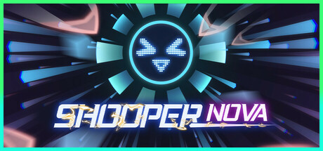
SHOOPER NOVA capsule

SHOOPER NOVA

Craft Your Ultimate Circular Fortress! Dive into SHOOPER NOVA, where you choose props and components to build a unique fortress. Unlock combos to shape your strategy and battle style. Become an unstoppable barrage machine and obliterate waves of enemies from all directions!

$6.99Very Positive(527)
StrategyRogueliteCasual
JamesikaApr 2, 2025

SHOOPER NOVA scores 70/100 — better than 28% of Strategy capsules (n=5,360).

Very Positive (527 reviews) · $6.99 · Released Apr 2, 2025 · By Jamesika

Quick text summary

SHOOPER NOVA scored 70/100 on Steam Analyzer — Good for a Strategy capsule. Top priority fix: [genre_clarity] Integrate a fortress or turret silhouette into the radial design to hint at the core circular building mechanic and differentiate from generic sci-fi action.

Capsule scores by dimension

  • Genre Clarity: 7/10 — Arcade action with sci-fi styling. The radial geometric design, glowing cyan crosshair eyes, and high-energy particle burst effects clearly signal an action-arcade game with sci-fi theming. The circular fortress concept is implied by the concentric radial geometry, but the specific tower-defense or bullet-hell mechanics are not immediately obvious at tiny size. At TINY size, the iconic radial pattern and glowing cyan eyes remain recognizable as sci-fi action, though the circular fortress building mechanic is not evident.
  • Title Readability: 8/10 — Clear neon italic text, readable at all sizes. PULSAR SCATTER is rendered in bright cyan neon italic capitals with solid outline, positioned horizontally below the central icon on a clear dark background. The text maintains good letter spacing and contrast against the dark base, staying readable even at small capsule size without collapse. At TINY size, the title remains legible with no letterform degradation, though fine italic serifs may blur slightly.
  • Contrast & Color: 8/10 — Strong cyan-to-dark value separation. The cyan glow of the central icon and neon title create excellent value separation against the dark purple-blue background, with the bright pink-peach gradient rays providing warm accent contrast. The silhouette of the radial burst remains sharp and distinct at all scales, and grayscale conversion maintains clear dark-to-light separation. The glowing effects enhance visibility in quick scroll, though some mid-tone pink blur may reduce definition at TINY sizes.
  • Uniqueness & Polish: 6/10 — Competent sci-fi aesthetic, generic icon execution. The neon glowing capsule style and radial burst composition feel contemporary and polished, but the central crosshair-eye motif is a common sci-fi trope without distinctive character or mechanical storytelling. The gradient rays and particle effects show craft, but the overall presentation reads as a well-executed generic sci-fi action template rather than a memorable or unique visual hook. Compared to top-tier indie capsules like DAVE THE DIVER or ANIMAL WELL, this lacks a distinctive art direction or visual storytelling that communicates core gameplay.
  • Brand Consistency: 6/10 — Consistent neon sci-fi palette, limited identity. The cyan-pink-dark purple color scheme is applied consistently across the icon and text, with coherent neon styling throughout. However, the radial burst and glowing eye motif do not establish a strongly recognizable or iconic brand symbol that would stand out across multiple touchpoints. The design is internally cohesive but lacks a memorable signature element or character that would reinforce brand recognition in future marketing or sequels.
  • Composition: 7/10 — Centered focal point, balanced layering. The composition uses a clear radial hierarchy with the glowing central icon as the dominant focal point, surrounded by symmetrical ray bursts that guide attention inward. The title sits anchored at the bottom center in safe margins, and the layered depth (particles, rays, central icon, text) creates visual interest without clutter. At SMALL and TINY sizes, the focal point remains clear and the title does not interfere with the icon, though the outer ray edges approach cropping risk on some sides.

What works

  • Readable neon title with strong contrast. Cyan italic capitals with solid outline maintain legibility from full size down to tiny thumbnail without letterform collapse.
  • Clear sci-fi action visual identity. The glowing crosshair icon and radial burst immediately signal high-energy arcade action with futuristic theming.
  • Strong dark-to-light value separation. Cyan and pink accents pop against the dark background in grayscale and color, ensuring visibility in quick scroll.

What hurts the capsule

  • Generic sci-fi action aesthetic. The crosshair-eye icon and radial burst are common sci-fi tropes that lack distinctive character or mechanical storytelling.
  • No visual hint of circular fortress gameplay. The capsule does not communicate the core mechanic of building a unique circular fortress or combo unlocks.
  • Limited brand recognition symbols. The radial glowing eye motif is thematically coherent but not sufficiently iconic to anchor future brand identity across touchpoints.

Priority fixes

  1. [genre_clarity] Integrate a fortress or turret silhouette into the radial design to hint at the core circular building mechanic and differentiate from generic sci-fi action.
  2. [uniqueness_polish] Introduce a signature character, mascot, or visual motif that reflects the fortress-builder strategy element and increases memorability against benchmark competitors.
  3. [brand_consistency] Refine the central icon into a more distinctive symbol that can serve as a recognizable logo across store pages, social media, and future updates.

Store copy priority fixes

  1. [feature_communication] Expand the elemental system explanation from one line to 2-3 sentences describing how Thunder, Ice, and Flame each create distinct strategic approaches or playstyles.
  2. [hook_strength] Replace 'ultimate' and 'unstoppable' with action-specific verbs: e.g., 'Build a rotating fortress that fires in every direction' instead of generic intensifiers.
  3. [tone_match] Reduce the sci-fi lore block (lines 2-3 of detailed description) to one sentence and move gameplay explanation forward to establish tone consistency.
  4. [uniqueness] Add a sentence explicitly stating what makes the rotating circular fortress mechanic distinct from stationary tower defense or other roguelike structures.

Related guides

  • Steam page optimisationCapsule, copy, screenshots, tags — the full Steam page conversion stack.
  • Steam tags guideTag selection, ordering, and how it shapes Steam's recommendation rails.

Steam app ID: 2853160 · Tags: Strategy, Roguelite, Casual, Action, Tower Defense