Scoring genre clarity...
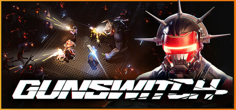
GUNSWITCH is a top-down arena shooter: Mow through hordes of demonic aliens. Upgrade your weapons to fire thousands of bullets within seconds. Escape space prison with your robot squad. Switch your loadout on the spot to adapt and become a killing machine.
$7.99Mixed(25)
Early AccessActionAdventure
Wicked TavernMay 19, 2025