Scoring genre clarity...
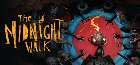
Follow The Midnight Walk in a dark adventure from the minds behind Lost in Random. Befriend a lost lantern creature and light your way through a world of wonder and terror. Outsmart monsters and marvel at details in a landscape handcrafted with real clay and animated in a stop motion style.
$14.99Very Positive(71)
AdventureHorrorAtmospheric
MoonHoodMay 8, 2025