Scoring genre clarity...

Murder at the Birch Tree Theater capsule

Murder at the Birch Tree Theater

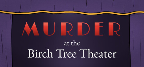
Uncover high drama in this whodunnit set in a small-town community theater. Gather clues by investigating the sets, casts and backstage crews of 10 theatrical productions, and piece together the story of each deadly crime.

$9.74Very Positive(12)
ExplorationPuzzlePoint & Click
Crucible Juice GamesMar 15, 2026

Murder at the Birch Tree Theater scores 73/100 — better than 61% of Exploration capsules (n=4,872).

Very Positive (12 reviews) · $9.74 · Released Mar 15, 2026 · By Crucible Juice Games

Quick text summary

Murder at the Birch Tree Theater scored 73/100 on Steam Analyzer — Good for a Exploration capsule. Top priority fix: [uniqueness_polish] Introduce a subtle distinctive element—such as a stylized shadow or iconic prop silhouette—that signals the specific mystery/investigation gameplay beyond just the theater setting.

Capsule scores by dimension

  • Genre Clarity: 7/10 — Theater mystery with clear setting cues. The capsule immediately signals a theater-based mystery through the marquee-style presentation, warm gold trim, and theatrical curtain backdrop. The word MURDER combined with 'Birch Tree Theater' establishes the whodunnit premise clearly. At tiny size, the theater setting remains readable, though the specific mystery-adventure genre is slightly less obvious without the subtitle text.
  • Title Readability: 8/10 — Strong hierarchy with clean serif typography. MURDER stands out in large coral-red bold letters with excellent contrast against the dark background, while the subtitle uses elegant white serif type for 'Birch Tree Theater'. The three-tier layout (MURDER / at the / Birch Tree Theater) creates natural rhythm and remains legible at small size, though the small 'at the' tagline becomes slightly soft at tiny sizes. The contrast and letter spacing work well across all viewing conditions.
  • Contrast & Color: 8/10 — Excellent warm-cool separation and silhouette clarity. The coral-red MURDER text pops sharply against the dark purple-black background, with the gold trim at top providing additional warm accent and visual framing. The white serif subtitle has strong value separation and maintains clarity in grayscale. The color palette creates memorable warmth while the dark background ensures text legibility at all sizes, and the silhouette of the marquee frame is crisp and distinct.
  • Uniqueness & Polish: 7/10 — Theater aesthetic with polished execution but modest originality. The marquee design is thematically appropriate and well-executed with proper lighting detail on the gold trim and purple velvet texture suggesting authentic theater atmosphere. However, the overall composition relies on a fairly standard marquee template that, while competent, lacks a distinctive visual hook or unexpected element that would elevate it to premium status. The craft is solid but the concept feels somewhat expected for a theater-mystery game.
  • Brand Consistency: 6/10 — Thematically consistent but limited identity signals. The capsule commits fully to the theater venue setting with period-appropriate typography, velvet textures, and marquee framing that align with the game's premise. However, there are no distinctive character symbols, logo marks, or signature visual motifs visible that would create immediate recognition beyond the venue itself. Internal consistency is high, but the brand identity relies primarily on setting rather than a unique visual signature.
  • Composition: 8/10 — Balanced focal hierarchy with theatrical framing. The marquee structure creates natural visual containment with the gold trim acting as a frame that keeps all text safely away from edge cropping. The three-tier text layout establishes clear hierarchy: MURDER dominates top, 'at the' centers subtly, and 'Birch Tree Theater' anchors the bottom. The purple background provides uncluttered breathing room, and the composition remains cohesive and readable at small and tiny sizes with no competing elements or wasted space.

What works

  • Strong color separation against dark background. Coral-red MURDER and white serif subtitle create excellent contrast and remain distinct in grayscale, popping effectively in quick-scroll conditions.
  • Clear theatrical setting establishment. Marquee design, gold trim, and velvet texture immediately communicate venue and whodunnit atmosphere without ambiguity.
  • Readable hierarchy across all sizes. Three-tier text layout with proper emphasis on MURDER ensures the title remains legible at tiny thumbnail size.
  • Safe composition with no edge cropping risk. Gold trim frame and centered layout keep all critical elements well within safe margins across typical Steam display dimensions.

What hurts the capsule

  • Generic marquee template execution. While competent, the theater marquee design relies on familiar conventions without a distinctive visual hook or unexpected design element that stands out against comparable indie titles.
  • Limited brand identity beyond setting. No character icons, symbolic motifs, or signature visual elements create immediate recognition; the identity depends entirely on venue framing rather than memorable branded marks.
  • Small tagline text loss at tiny size. The 'at the' secondary line becomes soft and less prominent at thumbnail sizes, creating slight reading friction despite overall good readability.

Priority fixes

  1. [uniqueness_polish] Introduce a subtle distinctive element—such as a stylized shadow or iconic prop silhouette—that signals the specific mystery/investigation gameplay beyond just the theater setting.
  2. [brand_consistency] Add a recurring visual motif or signature color accent that extends recognition beyond the marquee, such as a small emblem or period-accurate detail tied to the game's core identity.
  3. [genre_clarity] Consider a subtle inclusion of a clue-related visual (magnifying glass, script pages, etc.) within safe margins to strengthen the mystery-investigation genre signal at tiny sizes.

Store copy priority fixes

  1. [feature_communication] Specify the deduction mechanic: replace 'fill in the blanks to progress' with a concrete example—e.g., 'match suspects to motives,' 'reconstruct a timeline,' or 'identify false alibi details.'
  2. [uniqueness] Add one sentence explaining how the theatrical production integration affects puzzle design—e.g., 'each mystery unfolds within an active performance, where stage props and script details become investigative clues.'
  3. [feature_communication] Clarify the narrative structure: state whether the 10 incidents form one overarching mystery or 10 standalone cases, and hint at total playtime to set expectations.

Related guides

Steam app ID: 2864590 · Tags: Exploration, Puzzle, Point & Click, 2D, Isometric