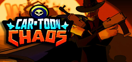
Car-Toon Chaos scores 85/100 — better than 97% of Vehicular Combat capsules (n=260).

Quick text summary

Car-Toon Chaos scored 85/100 on Steam Analyzer — Excellent for a Vehicular Combat capsule. Top priority fix: [brand_consistency] Introduce a distinctive character or signature villain silhouette that appears in multiple promotional assets to build brand recognition

Capsule scores by dimension

  • Genre Clarity: 9/10 — Explosive action racing immediately clear. The capsule communicates arcade racing action through a red sports car center-stage, police vehicle pursuit, explosions, and chaotic urban destruction. At tiny size, the car silhouette, fire effects, and police vehicle remain instantly recognizable as an action-driving game with combat/chase mechanics. The visual language is unmistakably arcade racing action rather than simulation or puzzle.
  • Title Readability: 9/10 — Bold logo legible at all sizes. VIRTUWHEEL uses a strong metallic blue outlined font with thick letterforms and high contrast against the orange explosion backdrop, making it readable even at tiny size. The FURY ROAD subtitle sits clearly below in orange-red, maintaining separation and legibility. Text placement avoids the busiest explosion zones and benefits from strategic dark-to-light contrast.
  • Contrast & Color: 9/10 — High-impact value separation throughout. The red sports car pops sharply against the dark blue sky and metallic building backdrop, while orange fire explosions create strong warm-cool contrast. Blue police vehicle, orange flames, and red car form a clear three-color hierarchy with excellent value separation that survives grayscale conversion. At tiny size, the bright explosions and red car remain distinctly separated from the darker background.
  • Uniqueness & Polish: 8/10 — Premium arcade action aesthetic achieved. The capsule feels deliberately crafted with cinematic lighting, dynamic action framing, and coherent VFX that avoids generic template look. The composition suggests real-time action, chaos, and player agency rather than static racing. Minor polish note: while the rendering quality is high, the scene is thematically familiar to action racing games, preventing a perfect 9.
  • Brand Consistency: 7/10 — Coherent but lacks distinctive signature. The art direction is internally consistent with warm explosion tones, metallic UI-influenced design in the title, and a cohesive blue-orange-red palette. However, without reference to in-game screenshots, no unique character, villain, or signature visual motif emerges as a memorable brand anchor. The style reads as high-quality action racing but not distinctly VIRTUWHEEL.
  • Composition: 9/10 — Excellent focal hierarchy and depth. The red sports car commands the center foreground with the police vehicle and explosions creating supporting action around it, while the city skyline anchors the background for depth. The title sits in the upper-middle region with clear breathing room, and no critical elements touch the unsafe margins. At small and tiny sizes, the car remains the clear primary subject with explosions guiding secondary focus.

What works

  • Genre instantly recognizable. Action racing gameplay is communicated clearly through car, police pursuit, and explosions visible even at tiny thumbnail size.
  • Title legible across all viewing scales. Strong metallic blue outline and thick letterforms maintain readability from full header down to tiny size without collapsing.
  • Dynamic composition with clear hierarchy. Red car as primary subject, explosions as secondary action, skyline as background creates strong depth layering.
  • Warm-cool color contrast optimized. Orange flames and red car against cool blue sky and buildings ensure high value separation and vibrancy on dark Steam background.

What hurts the capsule

  • Brand identity lacks distinctive signature. No iconic character, villain, or unique visual motif emerges to make VIRTUWHEEL instantly recognizable beyond 'action racing game.'
  • Scene composition leans generic. While well-executed, the concept of a sports car with explosions in a city is a familiar visual trope that doesn't hint at unique game mechanics like criminal hunts or dinosaur encounters mentioned in the description.

Priority fixes

  1. [brand_consistency] Introduce a distinctive character or signature villain silhouette that appears in multiple promotional assets to build brand recognition
  2. [genre_clarity] Add a subtle visual hint of the unique game mechanics (dinosaur silhouette, criminal icon, or deathmatch indicator) to differentiate from standard racing action

Store copy priority fixes

  1. [feature_communication] Add a sentence explaining what upgrades do mechanically and how they impact vehicle loadouts or driving abilities, e.g., 'Collect chicks and weapon upgrades to boost armor, speed, or firepower between matches.'
  2. [feature_communication] Specify the single-player progression structure and how it relates to the Mayor mystery, e.g., 'Campaign mode: Hunt the Mayor's minions across Bang City in a story-driven deathmatch gauntlet.'
  3. [genre_clarity] Add one sentence confirming game mode variety beyond deathmatch, e.g., 'Team combat, capture-the-flag, or endless arcade waves' to clarify multiplayer depth.
  4. [uniqueness] Expand the dinosaur angle with a concrete gameplay detail, e.g., 'Dinosaurs attack in random swarms—fight them or weaponize them against your rivals' to reinforce what makes this game mechanically distinct.

Related guides

Steam app ID: 2867200 · Tags: Vehicular Combat, Action, Racing, VR, Combat Racing