Scoring genre clarity...

Void Foundation: Into The Void capsule

Void Foundation: Into The Void

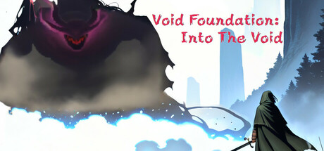
Void Foundation: Into The Void is a JRPG game with SCP & Randomized dungeon exploration element. Void Foundation tells the story of a future world which human history has been rewritten due to the discovery of Void Gate Players will be recruited as void adventurers, discover the secrets of the void.

$4.995 user reviews
IndieExplorationLore-Rich
#30A6D-S (Kuma)May 22, 2025

Void Foundation: Into The Void scores 60/100 — better than 0% of Indie capsules (n=11,449).

5 user reviews · $4.99 · Released May 22, 2025 · By #30A6D-S (Kuma)

Quick text summary

Void Foundation: Into The Void scored 60/100 on Steam Analyzer — Solid for a Indie capsule. Top priority fix: [title_readability] Replace thin serif red text with a bold sans-serif or outlined logotype that maintains legibility at 120px width; add a subtle dark stroke or background shape behind the text to ensure contrast at TINY size.

Capsule scores by dimension

  • Genre Clarity: 7/10 — Adventure fantasy with void mystery. The cloaked figure, ethereal blue atmosphere, and floating void portal establish an adventure-mystery tone. At TINY size, the silhouette of the robed character and ominous purple void entity remain legible, communicating a supernatural exploration game. The blue-tinted landscape with tower structures hints at exploration and world discovery, though the JRPG mechanics are not visually evident.
  • Title Readability: 5/10 — Title legible at full size only. The red serif text 'Void Foundation: Into The Void' is readable at full header size but becomes problematic at SMALL size due to thin letterforms against the light background. At TINY size (120x45), the title collapses into illegible red blurs and does not maintain clarity. The subtitle positioning on bright sky background further reduces contrast at smaller scales.
  • Contrast & Color: 6/10 — Moderate contrast with light background. The bright white-to-light-blue sky background creates adequate separation for dark silhouettes like the cloaked figure and purple void entity at full size. Against the Steam dark background (#1b2838), the composition reads acceptably due to value difference, but the light sky dominates and creates a 'floating in white' effect rather than bold pop. At TINY size, fine color details wash out and the overall reads as washed rather than punchy.
  • Uniqueness & Polish: 6/10 — Competent atmospheric art, generic presentation. The void entity with purple aura and landscape tower silhouettes show decent digital painting craft and thematic cohesion around the void concept. However, the composition follows common indie game capsule templates (figure in foreground, landscape behind, glowing entity) without a distinctive visual hook that signals 'JRPG with SCP elements' or differentiates from other mystery-adventure titles. The effect feels polished but not memorable.
  • Brand Consistency: 6/10 — Consistent void theme, lacks icon identity. The purple void entity, blue atmospheric palette, and ethereal visual language are internally coherent and align with the 'void' narrative concept. However, there is no distinctive logo, character emblem, or color motif that would be recognizable as a brand signature across multiple touchpoints. The visual identity feels thematically correct but not iconic enough to stand out as unique to this IP.
  • Composition: 6/10 — Clear focal point, unbalanced space usage. The cloaked figure in the right-center foreground and purple void entity in upper-left-center create a clear focal hierarchy at full size. The composition divides into sky (upper 60%), landscape (middle 30%), and figure (lower 40%), with good depth layering. At TINY size, the figure remains recognizable but the composition becomes cramped; the title intrusion in upper-right reduces available design space and risks Steam cropping issues on wide layouts.

What works

  • Strong atmospheric depth layering. Sky, floating structures, and foreground character create clear visual planes that guide the eye naturally through the composition at full size.
  • Silhouette clarity on dark contrast. The robed figure and void entity maintain readable outlines against the bright background, ensuring the character remains visible at small sizes.
  • Thematic visual coherence. Purple void glow, ethereal blue palette, and tower ruins consistently reinforce the mysterious void exploration premise throughout the image.

What hurts the capsule

  • Title becomes illegible at small sizes. Red serif text loses definition at SMALL and TINY scales due to thin strokes and insufficient contrast against the light sky background.
  • Light background lacks pop against Steam dark theme. The bright white-to-blue sky does not create bold separation against the #1b2838 dark background; the composition reads as washed and floating rather than anchored and punchy.
  • Generic atmospheric template without visual hook. The composition feels like a standard indie adventure template without distinctive iconography, character design, or visual mechanic that signals JRPG or SCP uniqueness.
  • Title placement risks cropping vulnerability. The red text positioned in the upper-right occupies valuable safe-zone space and may be cut off or reduced in certain Steam layout widths.

Priority fixes

  1. [title_readability] Replace thin serif red text with a bold sans-serif or outlined logotype that maintains legibility at 120px width; add a subtle dark stroke or background shape behind the text to ensure contrast at TINY size.
  2. [contrast_color] Darken or add subtle shadow to the sky gradient to increase overall value separation from Steam's dark background; consider a subtle vignette or darker overlay at the top to anchor the composition.
  3. [uniqueness_polish] Introduce a distinctive logo icon or symbolic void motif (e.g., a repeating glyph or abstract void sigil) that can serve as a recognizable brand element across marketing touchpoints.
  4. [composition] Reposition title to lower-left or center-bottom safe zone to reduce Steam cropping risk and free upper space for the void entity to breathe without visual competition.

Store copy priority fixes

  1. [hook_strength] Rewrite the short description to lead with a core gameplay verb and emotional stakes: 'You are a void adventurer sent into the abyss to harvest alien materials and uncover forbidden knowledge—but death isn't an escape; it's just the beginning.' This immediately communicates what you do and why it matters.
  2. [feature_communication] Move the bullet-point feature list to immediately after the first paragraph of the detailed description, before the lore exposition, so gameplay is clear before atmospheric worldbuilding.
  3. [uniqueness] Add a 1-2 sentence differentiator after the inspirations list, such as: 'But Void Foundation adds permanent character mutations and moral choices that reshape your world with every death, making no two playthroughs identical.' This shows what the game uniquely does.
  4. [audience_targeting] Add a sentence explicitly stating difficulty and play style expectations, e.g., 'Designed for players who thrive on challenge and consequence, where every death teaches you something new about the void.' This helps the right players self-identify.

Related guides

Steam app ID: 2868800 · Tags: Indie, Exploration, Lore-Rich, CRPG, Turn-Based Combat