Scoring genre clarity...

Slay the Spire 2 capsule

Slay the Spire 2

The iconic roguelike deckbuilder returns. Craft a unique deck, encounter bizarre creatures, and discover relics of immense power in Slay the Spire 2!

$24.99Very Positive(9,867)
RoguelikeCard GameDeckbuilding
Mega CritMar 5, 2026

Slay the Spire 2 scores 82/100 — better than 94% of Roguelike capsules (n=2,506).

Very Positive (9,867 reviews) · $24.99 · Released Mar 5, 2026 · By Mega Crit

Quick text summary

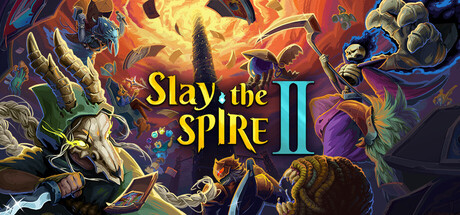
Slay the Spire 2 scored 82/100 on Steam Analyzer — Good for a Roguelike capsule. Top priority fix: [composition] Reduce background card and particle clutter density to give the title and primary characters more visual breathing room at small sizes

Capsule scores by dimension

  • Genre Clarity: 9/10 — Roguelike deckbuilder clearly signaled. Playing cards are visibly scattered across the upper portion of the image, and multiple distinct character archetypes (a skeletal figure with scythe, a horned beast, a robed figure) immediately suggest a roguelike RPG with card mechanics. At tiny size the card motif and fantasy combat characters still register enough to imply deckbuilder RPG. The spire tower rising in the background reinforces the franchise identity for returning players.
  • Title Readability: 8/10 — Bold golden title reads well. The title 'Slay the Spire II' uses a warm golden serif-style font with subtle drop shadow, placed centrally against a relatively calm mid-section of the composition. At full size it reads cleanly with strong contrast against the darker background. At tiny size 'Slay the Spire' remains legible due to its large bold letterforms, though 'the' in smaller size between the words is harder to parse, and the Roman numeral II is clear and iconic.
  • Contrast & Color: 8/10 — Warm palette pops on dark Steam bg. The fiery orange and golden central glow creates strong separation from Steam's #1b2838 dark background, drawing the eye immediately to the center of the image. Character silhouettes on both sides are well-lit with rim lighting that separates them from the busy background. In grayscale the central light source still provides clear value separation, though the left character's darker tones blend slightly into the environment at tiny size.
  • Uniqueness & Polish: 8/10 — Polished sequel with distinct identity. The illustration quality is high with detailed character designs, dynamic poses, and a cohesive hand-painted fantasy aesthetic that elevates it above typical indie capsules. The scattered playing cards as environmental elements cleverly reinforce the deckbuilding mechanic as a visual storytelling device. Compared to genre benchmarks like Balatro or Hades II it holds its own with distinctive craft, though the busy composition slightly dilutes the premium feel at smaller sizes.
  • Brand Consistency: 9/10 — Strong franchise identity signals. The returning character designs, card-scattered environment, and the iconic spire tower landmark establish immediate franchise recognition for existing fans. The warm fiery palette and painterly illustration style feel cohesive and consistent with the original game's visual identity. The Roman numeral II suffix and the retained character roster create a confident sequel identity that would be recognizable across store pages and marketing materials.
  • Composition: 7/10 — Dynamic but slightly busy layout. The composition uses a strong central vanishing point with the spire and warm glow anchoring the eye, flanked by characters on either side in a classic action-spread layout. The title sits in the center-middle zone with adequate breathing room. At small and tiny sizes the flanking characters and card clutter compete for attention and the overall image feels dense, though the central title placement ensures the most critical element survives cropping and compression.

What works

  • Card motif as genre signal. Scattered playing cards visibly embedded in the scene instantly communicate the deckbuilder genre without any text.
  • Strong central light source. The fiery orange glow at center creates clear value contrast against Steam's dark background and guides the eye to the title.
  • Franchise recognition cues. Returning character silhouettes and the spire tower provide instant brand recall for existing fans of the original game.
  • High illustration quality. The detailed painterly art style signals a premium product and stands above typical indie capsule quality in the genre.

What hurts the capsule

  • Busy background at tiny size. The dense environment of cards, characters, and particles competes with the title and collapses into visual noise at 120x45 pixels.
  • Left character blends into background. The darker horned character on the left lacks sufficient rim lighting separation from the environment in grayscale or at small sizes.
  • Small secondary text elements. Any smaller subtitle or detail elements in the composition become completely unreadable at tiny thumbnail size.
  • Crowded character staging. Three large characters plus environmental clutter create equal visual weight across the frame, reducing clear hierarchy at small sizes.

Priority fixes

  1. [composition] Reduce background card and particle clutter density to give the title and primary characters more visual breathing room at small sizes
  2. [contrast_color] Increase rim lighting on the left dark character to ensure clear silhouette separation from the background in grayscale and at tiny size
  3. [title_readability] Add a subtle dark vignette or semi-transparent backing behind the title text to ensure contrast is maintained across all rendering sizes
  4. [genre_clarity] Ensure at least one or two prominent card elements remain clearly visible even at tiny thumbnail crop to preserve the deckbuilder genre signal

Store copy priority fixes

  1. [feature_communication] Add one concrete example of a new card or mechanic (e.g., 'Recruit new Power cards that scale with ally health' or 'Master the Catalyst mechanic—build power through consecutive actions') to ground the 'brand new cards' claim with mechanical specificity.
  2. [uniqueness] Replace 'multiplayer-specific cards, powerful team synergies' with an explicit example of how co-op changes the win condition or strategy (e.g., 'Share relics with allies to amplify effects,' or 'New difficulty modifier Ascension 1 Co-op forces team-based deckbuilding').
  3. [feature_communication] Clarify whether lore discovery is a passive narrative unlock or an active mechanic tied to progression, and briefly explain how it affects gameplay (if at all).
  4. [genre_clarity] In the character section, explicitly state whether character selection is permanent per run or flexible, and whether character synergies matter for deck building advice.

Related guides

Steam app ID: 2868840 · Tags: Roguelike, Card Game, Deckbuilding, Strategy, Co-op