Scoring genre clarity...

Monster Prom 4: Monster Con capsule

Monster Prom 4: Monster Con

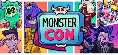
Can you find love at the nerdiest convention ever? "Monster Con" goes back to the multiplayer dating sim formula: go through absurd and funny situations as you find love among six sexy monsters! Who will you romance? The mimic who cosplays? The idol clown? Or the eldritch cutie? (There's also Liam)

$11.24Overwhelmingly Positive(21)
Visual NovelLGBTQ+Comedy
Beautiful GlitchApr 24, 2025

Monster Prom 4: Monster Con scores 83/100 — better than 99% of Visual Novel capsules (n=1,170).

Overwhelmingly Positive (21 reviews) · $11.24 · Released Apr 24, 2025 · By Beautiful Glitch

Quick text summary

Monster Prom 4: Monster Con scored 83/100 on Steam Analyzer — Good for a Visual Novel capsule. Top priority fix: [genre_clarity] Add a subtle UI hint or interaction element (e.g., heart icon, choice dialog indicator) to clarify the dating sim mechanic at tiny size

Capsule scores by dimension

  • Genre Clarity: 8/10 — Clear casual dating sim comedy. The vibrant, cartoony monster cast and playful art style immediately signal a lighthearted indie comedy game, not a dark horror or serious narrative title. At tiny size, the colorful character grid and bold 'MONSTER CON' branding read as social/party game, though the specific dating sim mechanic isn't immediately obvious without context. The convention/festival setting is legible through the character lineup format.
  • Title Readability: 9/10 — Excellent legibility at all sizes. The title 'MONSTER CON' uses bold sans-serif typography with a vibrant cyan/turquoise rounded rectangle background that creates strong contrast against the colorful character panels. Even at tiny size, the white letterforms with black outline hold clarity, and the logo shape itself is recognizable. The tagline area is appropriately subordinate and doesn't compete with the primary title.
  • Contrast & Color: 9/10 — Saturated colors with strong separation. The capsule employs a bold palette of hot pink, cyan, purple, orange, and lime green that pops decisively against Steam's dark background. Each character has distinct color blocking and silhouette; even in grayscale stress test, value separation between characters and background remains clear. The high saturation and consistent bright palette create excellent discoverability at scroll speed.
  • Uniqueness & Polish: 8/10 — Distinctive art direction, polished craft. The capsule exhibits a cohesive, hand-drawn cartoon aesthetic with clean line work, intentional color choices, and character designs that feel premium and purposeful rather than templated. The grid layout of six diverse monster characters with distinct personalities and design languages communicates the core appeal—variety of romance options—without generic stock imagery. The cyan logo badge with playful monster teeth detail shows deliberate craft.
  • Brand Consistency: 8/10 — Consistent character-driven identity. The capsule reinforces the game's identity through a recognizable character lineup that likely appears across promotional materials and store screenshots. The vibrant, distinct character palette and comic art style create a memorable visual signature tied to the Monster Prom franchise. The cyan title badge and bold typography appear consistent with series branding expectations for a spin-off.
  • Composition: 8/10 — Balanced grid layout, clear focal point. The composition uses a six-panel character grid that frames the central title logo, creating natural eye guidance and strong hierarchy. The title occupies the center-top with sufficient whitespace around it, and characters are distributed evenly without dead zones. At small and tiny sizes, the overall shape reads as a cohesive whole; individual character details blur appropriately while the color blocks and logo remain the primary focal points.

What works

  • Strong color contrast against dark background. High saturation palette of pink, cyan, purple, and orange creates immediate visual pop and excellent scroll discoverability on Steam's dark UI.
  • Clear central branding and title. The 'MONSTER CON' logo with cyan rounded rectangle background maintains legibility and recognition at all size scales, from full header to tiny thumbnail.
  • Coherent character-driven visual identity. Six distinct monster designs with individual color schemes and art styles communicate variety and personality while maintaining a unified, polished aesthetic.
  • Effective composition hierarchy. Grid layout naturally guides the eye through balanced character distribution and clear focal point, avoiding clutter or wasted prime real estate.

What hurts the capsule

  • Fine detail in character art becomes illegible at tiny size. While character silhouettes remain visible, facial expressions and costume details blur significantly at thumbnail scale, reducing personality perception.
  • No clear gameplay mechanic communication. The dating sim/strategy element is not visually conveyed; viewers unfamiliar with the Monster Prom franchise may see only a character roster without understanding the core mechanic.

Priority fixes

  1. [genre_clarity] Add a subtle UI hint or interaction element (e.g., heart icon, choice dialog indicator) to clarify the dating sim mechanic at tiny size
  2. [title_readability] Consider adding a small supporting tagline like 'Dating Sim' or 'Find Your Monster Match' below the logo for genre confirmation without reducing primary title impact

Store copy priority fixes

  1. [hook_strength] Replace the opening question with an active verb-forward hook: 'Romance monsters, build comic books, and compete with friends at the nerdiest convention ever' to lead with gameplay and excitement rather than curiosity alone.
  2. [feature_communication] Expand the comic book-building mechanic with a single sentence explaining what it is and why it matters: e.g., 'During the Con, you'll collect moments and choices that build a unique comic book reflecting your story.'
  3. [uniqueness] Add a sentence explicitly comparing this entry to the franchise's roots or previous games to clarify what 'returning to the multiplayer formula' means for new and returning players.
  4. [audience_targeting] Add a line explicitly acknowledging LGBTQ+ relationships or diverse romance options: e.g., 'Love is love—choose from six unique monsters with varied genders and identities.'

Related guides

Steam app ID: 2869860 · Tags: Visual Novel, LGBTQ+, Comedy, Dating Sim, Multiplayer