Scoring genre clarity...
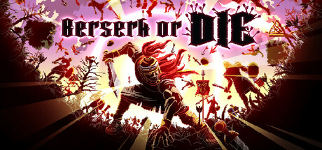
This is an action game in which players attempt to survive by defeating a number of enemies which appear from the left and right sides of the screen. Use a unique keyboard-banging control scheme for maximum dopamine! Go Berserk, or Die!
$3.19Mostly Positive(353)
ActionHack and Slash2D
Nao GamesJun 8, 2025