Scoring genre clarity...

Nexus Wars capsule

Nexus Wars

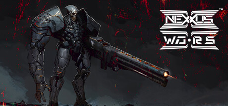
Dive into Nexus Wars, a relentless sci-fi odyssey 4,970 years in the future. Trapped in a 24-hour mind-swap loop as a Frame, survive dire danger, explore a hostile galaxy, and unravel the HyperNet’s mystery. Nine factions, epic lore, and a brutal GAME MASTER await. Will you break free or fall?

$1.991 user reviews
Early AccessActionRPG
Retro Epic EmpireApr 4, 2025

Nexus Wars scores 73/100 — better than 54% of Early Access capsules (n=3,067).

1 user reviews · $1.99 · Released Apr 4, 2025 · By Retro Epic Empire

Quick text summary

Nexus Wars scored 73/100 on Steam Analyzer — Good for a Early Access capsule. Top priority fix: [uniqueness_polish] Incorporate a distinctive visual element that hints at the game's core mechanic (e.g., a glitch effect, dual-vision overlay, or time-loop visual motif) to differentiate from generic sci-fi action.

Capsule scores by dimension

  • Genre Clarity: 8/10 — Clear sci-fi action with mech focus. The armored humanoid frame in heavy combat suit with rifle immediately signals sci-fi action gameplay. The sleek exoskeleton design, weaponry, and dark industrial aesthetic align with mech-action games. At tiny size, the silhouette and weapon are still recognizable as action-oriented sci-fi, though specific subgenre nuance (strategy vs. pure action) becomes ambiguous.
  • Title Readability: 7/10 — Clean logo, readable at small sizes. The 'NEXUS WARS' logo in white angular lettering with strong outline contrast is positioned clearly in the upper right against dark background. The geometric, tech-forward font matches the sci-fi theme and maintains legibility down to small size. At tiny size the logo remains recognizable though individual letterforms lose sharpness, and the secondary 'WARS' stacking ensures the core title reads.
  • Contrast & Color: 8/10 — Strong silhouette with accent colors. The dark-armored protagonist stands out well against the dark background through mid-tone blue-gray armor plating and orange/red accent lights on the rifle. Neon green and red particle effects in the background add visual pop and energy. In grayscale and at tiny size, the figure's bulk and bright accent points maintain clear separation from background, though the background particles become muddy noise.
  • Uniqueness & Polish: 7/10 — Competent mech design, generic setup. The frame character is well-rendered with clean armor detailing and intentional lighting that suggests AAA production quality. The composition and pose feel professional but align with common sci-fi action visual tropes rather than communicating a unique mechanic or distinctive selling point. The art is polished but the overall presentation reads as 'competent sci-fi action' without a memorable hook that differentiates it from other action titles.
  • Brand Consistency: 6/10 — Consistent but generically sci-fi. The dark armor aesthetic, neon accent colors, and angular tech typography form a cohesive internal identity. However, these elements are generic enough to dozens of sci-fi action games that without additional context, the visual identity lacks distinctive iconography. The logo design is recognizable on its own but doesn't establish a memorable brand signature that couldn't belong to another space-opera game.
  • Composition: 8/10 — Strong focal point, balanced layout. The armored protagonist occupies the left-center with clear visual weight and commanding pose, while the logo anchors the upper right without competing for attention. Particle effects provide depth layering and background interest without cluttering the primary figure. The composition scales well to small size where the frame remains the clear focal point, and the placement avoids dangerous edge cropping on both elements.

What works

  • Readable logo placement. The white 'NEXUS WARS' lettering in the upper right maintains legibility at small and tiny sizes with strong contrast and clean geometric letterforms.
  • Clear protagonist silhouette. The armored frame's bulk and posture immediately read as action-oriented at any size, communicating the sci-fi action genre through visual form alone.
  • Professional polish and lighting. The character model features intentional armor detailing, subsurface lighting, and directional light that conveys AAA production quality.
  • Effective color accent strategy. Orange rifle highlights and neon particle effects provide visual energy and break monotony of the dark palette while maintaining readability.

What hurts the capsule

  • Generic visual identity. The dark armor, neon accents, and tech aesthetic could belong to many space-action franchises, offering no distinctive brand signature.
  • Lack of unique mechanic communication. The capsule does not visually suggest the 24-hour loop mechanic, faction system, or mind-swap premise that differentiate the game—it reads as standard sci-fi action.
  • Background noise at small scales. The bright particle effects in the background become visual clutter at small and tiny sizes, competing with the primary silhouette and reducing clarity.

Priority fixes

  1. [uniqueness_polish] Incorporate a distinctive visual element that hints at the game's core mechanic (e.g., a glitch effect, dual-vision overlay, or time-loop visual motif) to differentiate from generic sci-fi action.
  2. [contrast_color] Reduce or reorganize background particle effects so they enhance depth without creating visual noise at small sizes; consider a cleaner gradient or minimal accent rather than scattered bright elements.
  3. [brand_consistency] Develop an iconic visual symbol or color signature (e.g., a faction emblem, time-loop spiral, or HyperNet motif) to establish memorable brand identity.

Store copy priority fixes

  1. [feature_communication] Add a single sentence under "Text-Based Zero Release" explaining the core Stage 1 loop: 'Make decisions and navigate survival scenarios through branching text choices, earning Sols and faction reputation before each 24-hour reset.' This clarifies what Early Access buyers actually do.
  2. [genre_clarity] Lead the short description with the dominant Stage 1 genre and defer future modes: 'A text-driven sci-fi adventure where your choices determine survival in a 24-hour mind-swap loop. (Roadmap includes mech battles and space combat.)' This manages expectation for Early Access.
  3. [audience_targeting] Remove 'Family Sharing' or add a line specifying tone: 'A mature, narrative-driven survival game for strategy and sci-fi fans who value choice and consequence.' This resolves the tone-audience disconnect.
  4. [uniqueness] Replace comp-title language with concrete mechanics: 'Unlike traditional roguelikes, your loop progress carries forward as persistent faction standing and HyperNet lore discoveries persist across reset cycles.' This articulates a specific differentiator.

Related guides

Steam app ID: 2874880 · Tags: Early Access, Action, RPG, Strategy, Auto Battler