Scoring genre clarity...

Jitter capsule

Jitter

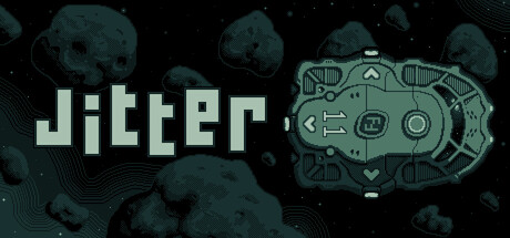
A sci-fi exploration & survival game where you take on the role of a spaceship’s AI. Explore, fight, and survive across a mining colony in the Main Asteroid Belt. Rebuild your ship. Rescue your crew. Reveal the truth behind your mission.

$9.99Very Positive(155)
Early AccessSpaceOpen World
Berko GamesNov 6, 2025

Jitter scores 68/100 — better than 15% of Early Access capsules (n=3,067).

Very Positive (155 reviews) · $9.99 · Released Nov 6, 2025 · By Berko Games

Quick text summary

Jitter scored 68/100 on Steam Analyzer — Solid for a Early Access capsule. Top priority fix: [genre_clarity] Incorporate a visual element that distinctly signals AI control or survival—consider HUD overlay, damage indicators, or crew rescue narrative hook—to differentiate from generic space exploration games.

Capsule scores by dimension

  • Genre Clarity: 7/10 — Sci-fi survival, clear but generic. The robotic spacecraft/drone device on the right immediately signals sci-fi technology and space setting. Asteroids in the background reinforce the asteroid belt mining premise. However, at TINY size, the genre reads as generic sci-fi rather than distinctly communicating exploration, survival, or AI-piloting as core mechanics—the visuals could apply to many space games.
  • Title Readability: 8/10 — Bold geometric font, solid clarity. The title 'Jitter' uses a strong geometric sans-serif with excellent contrast against the dark background and clear letterform definition. It remains legible at SMALL and TINY sizes without collapsing. The clean white-on-dark placement over a relatively clear background region ensures the word stays readable even at quick scroll speed.
  • Contrast & Color: 7/10 — Good separation with cool tones. The pale cyan/white title and spacecraft device pop clearly against the dark teal-black background and rocky asteroid silhouettes. The grayscale test shows solid value separation between foreground elements and background. However, the overall palette leans cool and muted—the asteroids and space background have similar tonal density, reducing silhouette pop slightly at TINY size.
  • Uniqueness & Polish: 6/10 — Competent sci-fi aesthetic, limited standout. The spacecraft illustration is clean and well-rendered with mechanical detail, showing solid craft in the linework and design. The layout feels polished and intentional. However, the overall composition—title left, device right, asteroids center—reads as a conventional sci-fi capsule template without a distinctive visual hook or unique selling point that separates it from other space exploration games in the genre.
  • Brand Consistency: 6/10 — Generic sci-fi, no iconic identity. The spacecraft device is rendered in a functional, industrial style consistent across visible frames, but it lacks a memorable motif or signature visual that would be instantly recognizable as 'Jitter.' The cool cyan palette and geometric typography are clean but not distinctive enough to create a lasting brand impression without other context.
  • Composition: 7/10 — Clear hierarchy, balanced layout. The title anchors the left side with strong weight, while the spacecraft device provides a focal point on the right, creating a natural left-to-right reading flow. Asteroids fill the background without overwhelming the main elements. At SMALL size the layout remains readable; however, at TINY size the asteroid detail becomes noise and the spacecraft slightly loses definition, though the title remains dominant.

What works

  • Strong title contrast and legibility. The bold geometric 'Jitter' text maintains excellent readability even at tiny thumbnail size with clear white-on-dark separation and clean letterforms.
  • Well-illustrated spacecraft asset. The cyan/blue robotic device features crisp mechanical linework and detail that communicates technology and sci-fi without feeling cheap or templated.
  • Balanced left-right composition. Title on left and device on right create a natural visual hierarchy and flow that guides the eye without clutter or dead space.

What hurts the capsule

  • Generic sci-fi visual language. The asteroids, spacecraft, and space setting are competent but visually indistinguishable from dozens of other indie space games, offering no unique hook or memorable branding.
  • Limited silhouette distinctiveness at tiny size. The asteroid field and dark background have similar tonal density, reducing foreground-background separation and making the overall capsule read as a soft wash at quick glance.
  • No core mechanic visual storytelling. The capsule shows a spaceship and asteroids but does not visually communicate the AI-piloting angle, survival tension, or exploration core that would differentiate this game's premise.

Priority fixes

  1. [genre_clarity] Incorporate a visual element that distinctly signals AI control or survival—consider HUD overlay, damage indicators, or crew rescue narrative hook—to differentiate from generic space exploration games.
  2. [uniqueness_polish] Add a signature color accent or lighting effect (e.g., orange warning light, glitch effect, or energy surge) that creates a memorable brand motif and elevates polish beyond template aesthetic.
  3. [contrast_color] Increase background asteroid contrast or add a subtle radial light source to push the spacecraft device further forward and strengthen silhouette separation at TINY size.

Store copy priority fixes

  1. [hook_strength] Rewrite the short description to lead with the AI role's gameplay consequence—e.g., 'As your ship's experimental AI, every module you attach and crew member you jettison changes how you survive the asteroid belt' to emphasize the unique perspective.
  2. [uniqueness] Add a sentence contrasting this game's AI-centric simulation with standard space sims—e.g., 'Unlike traditional captains, you manage your ship's systems in real-time, balancing crew survival against mission objectives' to articulate the distinct appeal.
  3. [feature_communication] Expand the mystery hook in the detailed description with one specific narrative question—e.g., 'Why was your AI awakened? What happened to the colony? And who is trying to stop you from finding out?' to give story-driven players a reason to care.
  4. [audience_targeting] Add a closing line acknowledging Early Access status and inviting feedback—e.g., 'Join development: help shape a hard sci-fi sandbox where every choice matters' to align with community-driven early access expectations.

Related guides

Steam app ID: 2877660 · Tags: Early Access, Space, Open World, Adventure, Exploration