Scoring genre clarity...
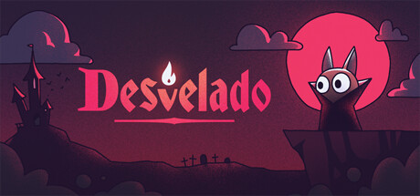
Desvelado capsule

Desvelado

Turn off the lights, dodge the ghosts and go to sleep as soon as you can in this hand-crafted 2d platform experience! In this vampiric precision platformer you will overcome challenging puzzles and deadly enemies before going to sleep in your cosy coffin. 

$6.99Very Positive(347)
Indie2DPrecision Platformer
Valentín Zacarías, Pablo Cuello, JoacoycoAug 14, 2024

Desvelado scores 78/100 — better than 85% of Indie capsules (n=11,727).

Very Positive (347 reviews) · $6.99 · Released Aug 14, 2024 · By Valentín Zacarías

Quick text summary

Desvelado scored 78/100 on Steam Analyzer — Good for a Indie capsule. Top priority fix: [title_readability] Simplify or slightly enlarge 'Desvelado' letterforms to maintain serif clarity and legibility when scaled to 120x45 pixel thumbnail size.

Capsule scores by dimension

  • Genre Clarity: 8/10 — Spooky platformer with clear identity. The central demonic silhouette with prominent eyes against a blood-red moon immediately signals horror-themed gameplay, while the ghost figures on either side reinforce the supernatural platformer aesthetic. At tiny size, the distinctive character shape and spectral enemies remain readable enough to suggest puzzle-platformer mechanics with a gothic twist, though the specific 'vampire precision platformer' subgenre is not entirely obvious without text.
  • Title Readability: 7/10 — Readable title with minor shrinking issues. The 'Desvelado' text uses a bold serif font with a warm red/pink color that contrasts adequately against the dark purple background and sits in a clean lower-center zone. At small size the title remains legible, but at tiny size (~120x45) the letterforms begin to compress and the serifs lose definition, though the overall word shape is still recognizable due to strong color separation.
  • Contrast & Color: 8/10 — Strong value separation with atmospheric mood. The blood-red moon and title text provide excellent luminosity contrast against the deep purple-black background, while the white-and-gray ghost figures and character eyes create clear silhouettes even in grayscale. The warm coral/red tones pop naturally against the cool dark purples, and the design maintains strong readability at small sizes due to deliberate light-dark layering and edge definition.
  • Uniqueness & Polish: 8/10 — Distinctive hand-crafted horror aesthetic. The art style features clean, intentional linework with a consistent illustrated approach—the demon character, stylized ghosts, and castle silhouette all communicate a cohesive hand-drawn sensibility that feels premium and deliberate rather than generic. The compositional choice of a glowing moon backdrop with character poses and atmospheric clouds demonstrates clear visual storytelling that hints at the core vampire-platformer mechanic without feeling templated or borrowed.
  • Brand Consistency: 8/10 — Consistent illustrated gothic brand voice. The capsule establishes a recognizable visual identity through its color palette (deep purple, blood red, white accents), character design language (large expressive eyes, silhouette-based forms), and gothic architectural motifs (castle, clouds). These elements align internally and would be distinctive enough to recognize in future marketing materials or screenshots, supported by the title's Spanish etymology fitting the spooky theme.
  • Composition: 8/10 — Clear focal hierarchy with balanced depth. The central demon character against the luminous moon serves as a strong primary focal point, with ghost figures positioned to the left and right creating secondary interest without competing for attention. The layering (background sky, mid-ground moon and character, foreground ghosts and castle) establishes clear depth, and the title sits safely in the lower region away from critical edges; the composition remains intact and readable across full, small, and tiny sizes.

What works

  • Iconic central character silhouette. The demon with large expressive eyes and distinctive horn shape creates an immediately memorable focal point that reads as supernatural platformer even at tiny thumbnail size.
  • Atmospheric color palette choice. The deep purple-to-red gradient with strategic white highlights creates a cohesive gothic mood that pops against Steam's dark background without feeling garish or oversaturated.
  • Hand-crafted visual consistency. Every element from the ghosts to the castle silhouette shares a unified illustrative style that signals premium indie craft and differentiates from generic horror templates.
  • Safe title placement and spacing. The 'Desvelado' text positions cleanly below the main composition with adequate contrast, avoiding edge cropping risks and maintaining readability across all viewing sizes.

What hurts the capsule

  • Title loses serif detail at tiny size. The decorative serif letterforms compress and blur when scaled down to ~120x45 pixels, reducing the sophistication of the typography at the smallest viewing conditions.
  • Ghost figures lack strong individuation. The two ghost shapes on either side are simple and somewhat generic spectral forms that don't reinforce the specific 'precision platformer' or 'vampire coffin' mechanics as clearly as the central character does.
  • Limited gameplay mechanic communication. While the horror genre is clear, the capsule does not visually hint at the 'lights off' puzzle element, dodge mechanics, or coffin-sleep core loop that distinguish this game within the horror-platformer space.

Priority fixes

  1. [title_readability] Simplify or slightly enlarge 'Desvelado' letterforms to maintain serif clarity and legibility when scaled to 120x45 pixel thumbnail size.
  2. [genre_clarity] Add subtle visual cue hinting at 'lights off' mechanic—such as a light switch silhouette, blown candle, or eyeball with pupil direction—to differentiate the puzzle-platformer angle.
  3. [uniqueness_polish] Refine ghost figures with more distinctive poses or expressions (e.g., fleeing postures, varied opacity) to reinforce dodging gameplay rather than generic haunting atmosphere.

Store copy priority fixes

  1. [feature_communication] Fix the 'FEATURED IN THIS GAME' section: remove the incomplete 'Manual control configuration comming soon' line and correct the typo to 'coming'; ensure all feature bullets are complete sentences.
  2. [audience_targeting] Add one sentence clarifying difficulty target: e.g., 'Perfect for puzzle-platformer fans who want precision mechanics without brutality' or 'Challenging but forgiving—respawn instantly to keep trying.'
  3. [feature_communication] Expand the 'Also: RUN!' section with 1-2 sentences explaining the chase/escape mechanic and how it differs from room-based puzzles, giving players a sense of pacing variety.

Related guides

Steam app ID: 2878710 · Tags: Indie, 2D, Precision Platformer, Puzzle Platformer, 2D Platformer