Scoring genre clarity...
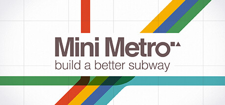
Mini Metro capsule

Mini Metro

Mini Metro is a strategy simulation game about designing a subway map for a growing city. Draw lines between stations and start your trains running. As new stations open, redraw your lines to keep them efficient. Decide where to use your limited resources. How long can you keep the city moving?

$9.99Overwhelmingly Positive(83)
StrategyPuzzleMinimalist
Dinosaur Polo ClubNov 6, 2015

Mini Metro scores 90/100 — better than 100% of Strategy capsules (n=5,436).

Overwhelmingly Positive (83 reviews) · $9.99 · Released Nov 6, 2015 · By Dinosaur Polo Club

Quick text summary

Mini Metro scored 90/100 on Steam Analyzer — Excellent for a Strategy capsule. Top priority fix: [contrast_color] Consider adding a subtle dark border or transition gradient around the capsule edges to soften the contrast between the light grid background and Steam's dark interface.

Capsule scores by dimension

  • Genre Clarity: 9/10 — Subway design strategy immediately clear. The colorful metro lines (red, yellow, blue, green, cyan) at the top and diagonal across the image instantly communicate a transit/subway theme. The tagline 'build a better subway' explicitly reinforces the strategic city planning genre. At tiny size, the distinctive diagonal colored stripes remain recognizable as metro lines, clearly signaling a transportation simulation game.
  • Title Readability: 9/10 — Strong sans-serif title with excellent contrast. The 'Mini Metro' title uses a bold, clean sans-serif typeface in dark gray that reads clearly against the light background at all sizes. The tagline 'build a better subway' is small but remains legible at small size and reinforces genre intent. At tiny size, the title maintains strong shape recognition and the overall visual hierarchy ensures the text does not collapse.
  • Contrast & Color: 9/10 — Vibrant colored lines pop against light background. The red, yellow, blue, and green diagonal metro lines create strong saturated contrast against the light grid background, and would maintain clear silhouette separation even against Steam's dark #1b2838 background. The colored stripes have crisp edges and high value separation, ensuring visibility during quick scroll and at tiny sizes. In grayscale, the distinct line widths and angles provide structural clarity.
  • Uniqueness & Polish: 9/10 — Iconic metro design with premium minimalism. The colorful diagonal metro line motif is distinctive and directly represents the core mechanic of drawing subway lines, avoiding generic simulation aesthetics. The clean grid background, paired with bold primary colors, communicates polish and intentional design rather than template-based work. This visual approach immediately signals indie strategy game sophistication and is memorable enough to establish brand recognition.
  • Brand Consistency: 9/10 — Signature metro line palette consistently applied. The red, yellow, blue, green, and cyan color scheme is the game's iconic visual language, directly tied to the subway mechanic and instantly recognizable from the capsule. The minimalist grid aesthetic and colored diagonal lines would be consistent across promotional materials and in-game UI. This creates a cohesive brand identity that signals Mini Metro immediately.
  • Composition: 9/10 — Balanced hierarchy with clear focal point. The colored metro lines serve as the primary focal point, drawing the eye diagonally across the composition while the title sits centered below in a strong secondary position. The grid background provides structure without clutter, and the spacing between the title, tagline, and graphic elements creates visual breathing room. At small and tiny sizes, the composition remains well-balanced with no elements competing for attention or sitting awkwardly at edges.

What works

  • Genre instantly communicable. The metro line visual metaphor and explicit 'build a better subway' tagline make the strategy simulation genre unmistakable even at tiny thumbnail size.
  • Bold color palette with strong contrast. Primary colored diagonal stripes create vibrant visual pop that reads clearly against both light and dark backgrounds, maintaining silhouette clarity at all scales.
  • Iconic brand identity established. The colored metro line motif is distinctive, directly linked to core gameplay, and memorable enough to differentiate Mini Metro from generic simulation capsules.
  • Clean typography and hierarchy. Sans-serif title and minimal tagline are well-positioned and legible across all viewing sizes without sacrificing visual balance or composition clarity.

What hurts the capsule

  • Light background may clash with Steam dark theme. While the light grid background provides excellent internal contrast, it creates a stark transition against Steam's dark #1b2838 background that could feel visually jarring in the store.
  • Minimal information about gameplay depth. The capsule communicates the subway theme clearly but does not hint at the strategic resource management or time-pressure mechanics that differentiate the game from simpler transit apps.

Priority fixes

  1. [contrast_color] Consider adding a subtle dark border or transition gradient around the capsule edges to soften the contrast between the light grid background and Steam's dark interface.
  2. [uniqueness_polish] Optionally add a visual hint of the time-pressure or station growth mechanic (e.g., subtle clock icon or expanding network visual) to communicate strategic depth beyond basic line-drawing.

Related guides

  • Steam page optimisationCapsule, copy, screenshots, tags — the full Steam page conversion stack.
  • Steam tags guideTag selection, ordering, and how it shapes Steam's recommendation rails.

Steam app ID: 287980 · Tags: Strategy, Puzzle, Minimalist, Simulation, Trains