Scoring genre clarity...
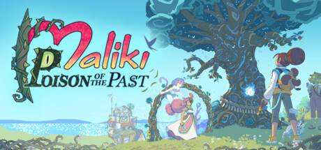
Join Maliki and her wacky family in their epic battle against Poison, a fearsome plant creature that has colonized space-time. Go along on a fantastic odyssey through the ages that provides a unique mix of exploration, temporal riddles and turn-based fights full of surprises.
$29.99Very Positive(94)
AdventureRPGStrategy RPG
Blue BansheeApr 22, 2025