Scoring genre clarity...
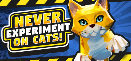
The test cats have broken free! They're getting into all the equipment, from jetpacks to lawnmowers and paintball guns! Bounce, bash, and blast your way to the top of the scoreboard! Is there more to the lab? Who's behind it all?
$9.996 user reviews
ActionCatsFunny
LetMeowt Games LLCMay 14, 2026