Scoring genre clarity...
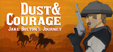
"Dust & Courage: Jake Bolton's Journey" is an open-world, single-player RPG set in a fantasy Wild West. You play as cowboy Jake Bolton; every choice is yours. Talk or fight, pick friends or foes, explore towns and deserts, and shape your own adventure. Your adventure, your rules.
$7.99Positive(23)
WesternRPGChoices Matter
StoryForge GamesJan 27, 2026