Scoring genre clarity...
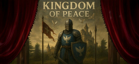
In Kingdom of Peace you play as Racław, a hero who faces war, danger and difficult decisions. Explore medieval kingdoms, engage in intrigue, fight and create your own destiny, and finally create your own settlement!
Free to PlayMixed(26)
AdventureSimulationMedieval
Prosuntal Games StudioJun 16, 2025