Scoring genre clarity...

Risky Rocket capsule

Risky Rocket

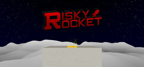
Risky Rocket is a 3D Rocket Jumping platformer. Hone your skills and launch through the climb map and many time trial levels. Using the physics of momentum, and propulsion of rockets to build up speed and become a master of Rocket Jumping.

$3.992 user reviews
ActionFirst-Person3D Platformer
Cyyc GamesJul 20, 2025

Risky Rocket scores 67/100 — better than 13% of Action capsules (n=8,534).

2 user reviews · $3.99 · Released Jul 20, 2025 · By Cyyc Games

Quick text summary

Risky Rocket scored 67/100 on Steam Analyzer — Solid for a Action capsule. Top priority fix: [genre_clarity] Emphasize the rocket-jumping mechanic by adding a trail, arc, or secondary platform elements that suggest trajectory and momentum-based platforming rather than static placement.

Capsule scores by dimension

  • Genre Clarity: 7/10 — Rocket action gameplay readable. The small yellow rocket on a bland platform against a starry sky communicates action and movement, though the minimalist presentation obscures whether this is a platformer versus a shooting game. At tiny size, the rocket silhouette remains visible but the platforming context (jumping, climbing) is not obvious without prior knowledge. The moonscape setting supports action context adequately.
  • Title Readability: 8/10 — Bold red title stands clear. The large red 'RISKY ROCKET' text with uppercase letterforms and slight feathered outline contrasts strongly against the dark starry background, remaining legible at small and tiny sizes. The two-line stacked layout maximizes horizontal space and avoids thin serifs. At tiny size the text compresses but maintains clarity due to weight and value separation.
  • Contrast & Color: 8/10 — Strong value separation works. Bright red title pops against deep navy-black starfield with clear silhouette separation, and the warm yellow rocket contrasts well against cool white and gray platform geometry. The grayscale test holds: red becomes medium-dark gray but remains distinct from the background dark grays. Strong lighting separation between subject and space background supports quick scanning.
  • Uniqueness & Polish: 5/10 — Clean but generic presentation. The capsule uses a straightforward sci-fi platformer aesthetic with competent 3D rendering of the moon landscape and rocket, but lacks a distinctive hook or memorable visual identity beyond the red title. The scene reads as a functional setup (rocket on a platform) rather than communicating the unique rocket-jumping mechanic or a signature art style. Craft is competent but the composition feels like a standard indie game launch screen.
  • Brand Consistency: 6/10 — Minimal identity signals present. The red color in the title and rocket forms a basic palette coherence, but without additional brand cues from other materials or a distinctive character, logo system, or visual motif, internal consistency feels generic. The simple geometric platform and starfield lack recognizable iconography that would signal 'Risky Rocket' specifically on a second viewing. Reliance on title text alone limits brand recall.
  • Composition: 6/10 — Centered layout lacks tension. The title sits in the top center with adequate breathing room, and the rocket-on-platform occupies the center-bottom, creating a stable but flat hierarchy with minimal visual drama. The composition is safe and symmetrical but does not guide the eye with layering or focal point emphasis; at tiny size the scene compresses to an undifferentiated block. The starfield background is unused space that could reinforce thematic depth or action energy.

What works

  • Red title contrast. Bright red 'RISKY ROCKET' maintains sharp legibility at all sizes against the dark navy starfield due to strong value and saturation separation.
  • Clear focal subject. The yellow rocket on the platform provides an obvious primary element that reads distinctly even when scaled to tiny thumbnail size.
  • Legible letterforms. The uppercase sans-serif title uses good weight and spacing, avoiding thin or decorative fonts that collapse at small sizes.

What hurts the capsule

  • Generic platformer setup. The rocket-on-platform scene lacks a distinctive hook or gameplay-specific visual cue that differentiates this from a standard space platformer launch screen.
  • Minimal brand identity. No iconic character, logo system, or signature visual motif establishes a recognizable brand beyond the red title text alone.
  • Unused compositional depth. The starfield background is largely empty; the layout feels flat and symmetrical with no layering that would create visual tension or guide attention through space.
  • Unclear unique mechanic. The capsule does not visually communicate the rocket-jumping platformer core mechanic; it reads as a generic rocket-in-space setup rather than showcasing momentum, propulsion, or skill-based action.

Priority fixes

  1. [genre_clarity] Emphasize the rocket-jumping mechanic by adding a trail, arc, or secondary platform elements that suggest trajectory and momentum-based platforming rather than static placement.
  2. [uniqueness_polish] Introduce a signature visual element or distinctive art style—such as a character silhouette, iconic rocket design, or dynamic motion blur—that creates a memorable identity and lifts the presentation above generic sci-fi platformer tropes.
  3. [composition] Rebalance the layout to create depth layering: position the rocket in mid-air mid-jump rather than resting on the platform, and adjust the camera angle to emphasize vertical challenge and upward momentum.
  4. [brand_consistency] Develop a coherent color palette and motif system visible across the capsule and store screenshots; consider adding a logo or character mark that would be instantly recognizable in future promotional materials.

Store copy priority fixes

  1. [hook_strength] Replace the repetitive opening with a punchier hook that captures the appeal of rocket jumping physics: 'Master the art of rocket propulsion to defy gravity and tear through 3D challenges at breakneck speed.' This leads with the emotional payoff rather than mechanic naming.
  2. [feature_communication] Expand the climb map and time trial sections with concrete gameplay details: explain how the fall-to-start mechanic creates tension, describe the progression from tutorial to mastery, and clarify how leaderboards work. Answer 'what does a typical session look like?'
  3. [uniqueness] Add a sentence explaining what makes rocket jumping distinct from other platformers: e.g., 'Unlike traditional platforming, every movement demands precise rocket timing and momentum chains—mastery feels like unlocking a skill few possess.'
  4. [feature_communication] Remove or clarify the 'something more lucrative than Gold' teaser; either name the reward tier or delete it to avoid confusion about progression systems.

Related guides

Steam app ID: 2905160 · Tags: Action, First-Person, 3D Platformer, Retro, Precision Platformer