Scoring genre clarity...

Clocking In to Fight a Lich in Another Realm capsule

Clocking In to Fight a Lich in Another Realm

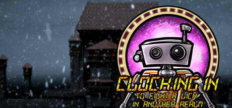
It's finally time to start your new job at The Company! Time to clock in and see what's on the other side of The Company's newly developed portal technology. Fight undead, defeat bosses, and prevent the invasion of a lich's undead army.

$11.994 user reviews
Boomer ShooterActionFPS
Dead Tired GamesJun 20, 2025

Clocking In to Fight a Lich in Another Realm scores 63/100 — better than 5% of Boomer Shooter capsules (n=263).

4 user reviews · $11.99 · Released Jun 20, 2025 · By Dead Tired Games

Quick text summary

Clocking In to Fight a Lich in Another Realm scored 63/100 on Steam Analyzer — Solid for a Boomer Shooter capsule. Top priority fix: [title_readability] Simplify title to only 'CLOCKING IN' or use a single bold line that remains legible at 120x45 pixels; move subtitle to a secondary asset or remove entirely.

Capsule scores by dimension

  • Genre Clarity: 7/10 — Action with comedic office twist. The giant robot mascot head wearing sunglasses and the glowing purple portal in the background effectively signal an action game with absurdist humor, though the exact dungeon-crawler lich-fighting mechanic is not immediately obvious at tiny size. The winter snowy mansion setting and portal glow establish a supernatural action premise, but the whimsical robot mascot muddles whether this is pure action or action-comedy, which reads as intentional genre blending rather than confusion.
  • Title Readability: 5/10 — Title legible at full, collapses tiny. The yellow outlined text 'CLOCKING IN' is readable at full size with decent contrast against the dark background, but the subtitle 'TO FIGHT A LICH IN ANOTHER REALM' is significantly smaller and becomes illegible at tiny thumbnail size due to thin letterforms and low scale. At 120x45 pixels, only fragmented letters remain visible, severely damaging discoverability in quick Steam browsing where the full title cannot be parsed.
  • Contrast & Color: 7/10 — Strong purple focal pop, solid separation. The bright magenta/purple glowing portal and the yellow-gold outlined robot head create strong value contrast against the dark cool-toned winter mansion background and Steam's dark UI. In grayscale the robot silhouette and portal glow maintain clear separation, though the snowy mansion detail in the background creates mid-tone texture that slightly reduces the crispness of the overall read at tiny size.
  • Uniqueness & Polish: 6/10 — Competent with memorable mascot. The robot mascot with sunglasses is a distinctive and quirky branding element that differentiates this from typical dark action games, and the office-job-meets-lich-invasion concept is conceptually fresh. However, the execution feels somewhat generic with a standard snowy mansion backdrop, glowing portal effect, and stock winter particle effects; the craft is solid but the visual presentation does not feel premium or as polished as the top-tier benchmarks in the genre.
  • Brand Consistency: 6/10 — Robot mascot is recognizable, limited cues. The robot head with sunglasses serves as an iconic brand element that could be recognized in future marketing materials, and the neon yellow/purple color scheme is consistent and memorable. However, without access to the six available store screenshots in this analysis, the broader brand identity cohesion across the full game's visual presentation cannot be fully assessed; from this capsule alone, the identity signal is moderately strong but relies heavily on the mascot design rather than deeper art direction.
  • Composition: 7/10 — Clear focal point, balanced layers. The large robot head occupies the center-right upper portion as the primary focal point, with the snowy mansion silhouette receding into the background and the glowing portal supporting the hierarchy without competing. Title placement is bottom-left in yellow, which is readable at full size but crowds the lower margin; at tiny size the composition remains intact, though the subtitle text disappears entirely, leaving only the mascot and portal as the readable visual anchors.

What works

  • Distinctive robot mascot branding. The sunglasses-wearing robot head is memorable and quirky, setting this apart from generic dark action titles and creating a recognizable visual identity.
  • Strong purple and yellow color pop. The bright magenta portal glow and gold outline on the mascot create excellent contrast against the dark Steam background and winter tones, ensuring visibility in browsing.
  • Clear primary focal point. The large centered robot head commands immediate attention at all sizes, with supporting elements like the portal and mansion properly receding to support hierarchy.

What hurts the capsule

  • Subtitle becomes unreadable at tiny size. The second line of title text drops below legibility thresholds at 120x45 pixels, forcing viewers to rely only on the mascot silhouette to understand the game at thumbnail size.
  • Generic winter mansion background. The snowy mansion and particle effects feel like stock assets rather than distinctive art direction, limiting the premium feel compared to top-tier action game benchmarks.
  • Limited visual storytelling of core mechanic. While the office-lich-invasion concept is interesting, the capsule does not visually communicate the unique job-clock-in gameplay hook, instead relying on mascot charm alone.

Priority fixes

  1. [title_readability] Simplify title to only 'CLOCKING IN' or use a single bold line that remains legible at 120x45 pixels; move subtitle to a secondary asset or remove entirely.
  2. [genre_clarity] Add a subtle UI element like a time clock, job badge, or spell effect on the robot to reinforce the office-action-fantasy hybrid genre faster at tiny size.
  3. [uniqueness_polish] Replace the generic snowy mansion background with a more stylized or visually distinctive Company environment that signals premium indie production.

Store copy priority fixes

  1. [hook_strength] Rewrite the opening to lead with the core excitement: 'Your mundane office job takes a dark turn when you're sent through a portal to fight an undead army—armed only with company-issued equipment and paycheck upgrades.'
  2. [feature_communication] Expand the detailed description to include: specific weapon or upgrade examples, number of levels or bosses, what the 'silly doodads' actually do, and what makes the boomer shooter gameplay feel fresh.
  3. [uniqueness] Add a sentence that explicitly contrasts this game with other boomer shooters—e.g., a unique mechanic, art style, or level design philosophy specific to this title.

Related guides

Steam app ID: 2913530 · Tags: Boomer Shooter, Action, FPS, Shooter, Singleplayer