Scoring genre clarity...
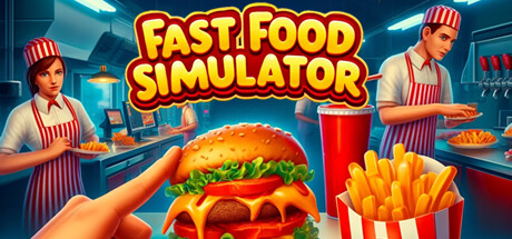
Fast Food Simulator capsule

Fast Food Simulator

Welcome to the world's most chaotic place! Play solo or co-op with up to 6 players. Run a fast-food restaurant, and work with your friends to expand your business. Take orders, make burgers, and increase your earnings by dealing with customers.

$9.74Very Positive(151)
SimulationOnline Co-OpCooking
No Ceiling GamesDec 10, 2024

Fast Food Simulator scores 87/100 — better than 98% of Simulation capsules (n=5,554).

Very Positive (151 reviews) · $9.74 · Released Dec 10, 2024 · By No Ceiling Games

Quick text summary

Fast Food Simulator scored 87/100 on Steam Analyzer — Excellent for a Simulation capsule. Top priority fix: [genre_clarity] Maintain the burger-in-hand foreground element as the signature brand mark across all promotional materials and store screenshots for consistency.

Capsule scores by dimension

  • Genre Clarity: 9/10 — Crystal clear simulation genre hook. The capsule immediately communicates a fast-food management simulator through multiple reinforcing cues: a prominent hand holding a burger in the foreground, uniformed workers in red-and-white striped aprons in the background, a busy restaurant kitchen setting with visible food prep stations, and a colorful burger with fries in branded packaging. At tiny size, the burger silhouette and kitchen environment remain unmistakable, leaving no ambiguity about the core gameplay loop of food service simulation.
  • Title Readability: 9/10 — Bold yellow text dominates clearly. The title 'FAST FOOD SIMULATOR' uses thick, high-contrast yellow letterforms with a bold red outline and shadow effect that stands decisively against the dark blue kitchen background. The typography maintains excellent legibility at all sizes from full header down to tiny thumbnail, with generous letter spacing and no competing elements obscuring the text. Even at 120×45 pixels, the chunky serif style and warm yellow pop ensure the title remains immediately recognizable.
  • Contrast & Color: 9/10 — Excellent value separation and vibrancy. The composition leverages strong value contrast with bright cyan kitchen lighting and warm golden tones in the food (burger, fries) against the deep blue-black background, creating clear silhouette separation throughout. The red-and-white striped uniforms and red drink cup provide additional saturation anchors that guide the eye and maintain visual pop even in grayscale. At small sizes, the burger hand in the foreground maintains sharp edge definition against the background, and the yellow title text has maximum punch against the cool blue environment.
  • Uniqueness & Polish: 8/10 — Polished execution with strong personality. The capsule demonstrates high production quality with professional 3D rendering, intentional lighting design (warm kitchen glow, cyan overhead lights), and a cohesive cartoony art style that conveys fun and accessibility. The composition shows thoughtful visual storytelling: the prominent first-person burger hold immediately communicates player agency and the core interaction loop, while background workers suggest co-op multiplayer depth. The design feels premium compared to generic management sims, though the overall concept remains within expected simulation genre boundaries rather than introducing a wholly novel hook.
  • Brand Consistency: 8/10 — Strong visual identity within simulator genre. The capsule establishes recognizable brand identity through consistent use of red-and-white striped worker uniforms (repeated on multiple NPCs), a distinctive color palette of warm golds and cool cyans, and the iconic first-person burger interaction as a signature mechanic reveal. The cartoon 3D rendering style is cohesive across all visible elements—from character proportions to food styling to environment details. These visual cues create a memorable identity that would be recognizable in store screenshots and marketing materials, positioning it distinctly within the simulator subgenre.
  • Composition: 9/10 — Masterful hierarchy and focal point clarity. The composition establishes a perfect pyramid of attention: the oversized burger held in the first-person foreground (bottom center) immediately anchors the viewer, the kitchen environment with busy workers creates engaging midground activity, and the bold title text at top provides strong secondary hierarchy without competing. Safe margins are well-managed, with the title centered and clear of edges, and the foreground hand positioned to avoid Steam's typical crop lines. At tiny sizes, the burger remains the unmistakable focal point, and the kitchen workers fade appropriately into context rather than creating visual clutter.

What works

  • Iconic first-person burger interaction. The hand holding the burger in the foreground instantly communicates player agency and the core game loop, making the primary mechanic tangible and memorable even at thumbnail size.
  • Cohesive warm-cool color balance. The interplay between warm golden food tones and cool cyan kitchen lighting creates visual depth and prevents the composition from feeling flat or muddy.
  • Multiplayer context clearly visible. The three uniformed workers in the background environment effectively communicate the co-op gameplay feature without overwhelming the primary burger focus.
  • High production rendering quality. The 3D art style is polished and professional-looking, with careful attention to food appeal and worker character design that elevates the perceived quality above generic asset-flip simulators.

What hurts the capsule

  • Kitchen background slightly busy. The counter, equipment, and additional UI elements in the background create moderate visual noise that could distract from the primary burger subject at small sizes if not for the strong foreground anchor.
  • Limited differentiation from similar sims. While well-executed, the core visual concept of 'worker in kitchen with food' is well-trodden in the management simulator space, making it rely more on execution polish than innovative hook.

Priority fixes

  1. [genre_clarity] Maintain the burger-in-hand foreground element as the signature brand mark across all promotional materials and store screenshots for consistency.
  2. [uniqueness_polish] Consider introducing a distinctive visual element or quirky detail (e.g., signature ingredient, unique uniform variant, or chaos mechanic visual cue) that differentiates this from Supermarket Simulator and other retail sims visually.

Related guides

Steam app ID: 2916430 · Tags: Simulation, Online Co-Op, Cooking, Multiplayer, Management