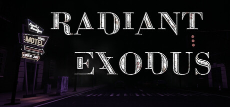
Radiant Exodus scores 60/100 — better than 0% of FPS capsules (n=1,272).

Quick text summary

Radiant Exodus scored 60/100 on Steam Analyzer — Solid for a FPS capsule. Top priority fix: [genre_clarity] Add a silhouette of Sarah in combat stance or holding a weapon to immediately signal action-adventure gameplay at all sizes.

Capsule scores by dimension

  • Genre Clarity: 5/10 — Ambiguous sci-fi horror mix. The capsule shows a neon-lit diner sign and purple atmospheric lighting suggesting sci-fi or cosmic horror, but the imagery is too abstract to clearly communicate action-adventure or RPG gameplay. At tiny size, only the glowing sign silhouette reads, leaving genre intent unclear without prior knowledge of the title or description.
  • Title Readability: 7/10 — Clear at full size, legible at small. The title 'RADIANT EXODUS' uses a clear serif outline font with strong white-to-black contrast against the dark background, maintaining readability even at small capsule size. However, at tiny thumbnail size (120x45), the letterforms begin to compress and the outlined style becomes slightly fuzzy, though still identifiable as text rather than becoming unreadable.
  • Contrast & Color: 7/10 — Strong value separation with purple accent. The white outlined title text and bright diner neon signage create sharp contrast against the dark black-to-purple gradient background, ensuring clear silhouette separation at small sizes. The purple atmospheric lighting adds color interest without muddying the core contrast, though the overall palette is narrow (blacks, whites, purples only) which slightly limits visual pop.
  • Uniqueness & Polish: 6/10 — Stylish but relies on generic diner trope. The neon diner aesthetic with retro signage feels polished and intentional, with deliberate art direction toward 1980s Americana merged with sci-fi elements. However, the neon diner + cosmic horror combination is a familiar indie game visual shorthand that lacks a distinctive hook specific to Radiant Exodus's narrative of Sarah and her survival journey.
  • Brand Consistency: 5/10 — No recognizable identity signals present. The capsule shows only environmental atmosphere (diner, neon, purple glow) with no character, iconic symbol, or visual motif unique to the game's brand that could be recognized in future marketing. Without reference to the 8 available screenshots, there are no memorable identity cues—the diner and purple lighting could apply to many indie sci-fi games.
  • Composition: 6/10 — Balanced but unfocused focal point. The composition balances the diner sign (left side) with title text (center-right), creating reasonable depth with foreground neon, mid-ground buildings, and dark sky background. However, no single element emerges as a dominant primary subject; the focal point is split between text and environment, and at tiny size the composition collapses into an illegible purple smear with faint white text.

What works

  • Strong outline typography. The white outlined serif letters on 'RADIANT EXODUS' maintain clarity against the dark background and remain legible at small capsule sizes due to intentional contrast and outline treatment.
  • Atmospheric visual storytelling. The neon diner, purple sky, and environmental lighting effectively suggest a sci-fi horror tone that aligns with the game's premise of strange lights and cosmic threat.
  • Safe title placement. The title sits in the center-right area away from edges, ensuring it survives Steam's standard cropping across different display sizes.

What hurts the capsule

  • No character or protagonist visibility. The capsule shows only environment and signage, not Sarah the ex-soldier protagonist, missing an opportunity to communicate the action-adventure player perspective at a glance.
  • Generic sci-fi diner aesthetic. The neon diner + purple cosmic horror visual is a familiar indie game trope that does not differentiate Radiant Exodus from dozens of other retro sci-fi indie titles in the genre.
  • Unclear genre at thumbnail scale. At 120x45 pixels, the capsule reads as abstract purple with text rather than clearly communicating action, adventure, or RPG gameplay to quick-scrolling players.

Priority fixes

  1. [genre_clarity] Add a silhouette of Sarah in combat stance or holding a weapon to immediately signal action-adventure gameplay at all sizes.
  2. [uniqueness_polish] Introduce a distinctive visual motif (alien creature hint, strange light phenomenon, or signature game asset) to separate this from generic neon diner tropes.
  3. [brand_consistency] Establish a signature color palette or symbol that reinforces the game's identity and survives small-scale reproduction.
  4. [composition] Create a clear primary focal point (character or central threat) rather than splitting attention between environment and title.

Store copy priority fixes

  1. [uniqueness] Add a sentence explicitly differentiating this game mechanically or narratively from similar action-horror titles (e.g., 'Unlike typical survival shooters, you cannot hide or retreat—only forward momentum and precise ammo management keep you alive,' or a unique twist on the Exodus Project concept).
  2. [feature_communication] Expand 'Unfold a mystery' to explain the player's active role: Are there choice points? Does gathering intel affect gameplay or story outcomes? Does the mystery solve mechanically or purely narratively?
  3. [audience_targeting] Add a sentence explicitly addressing playstyle expectations: approximate campaign length, difficulty defaults, or a signal about pacing (e.g., 'steady action-driven pacing with minimal downtime' or 'methodical, tension-building exploration').
  4. [hook_strength] Strengthen the opening philosophical hook by connecting it to Sarah's personal journey: 'Something meant to evolve humanity is tearing Gleam City apart—and Sarah must uncover the truth before she loses her father to it.'

Related guides

Steam app ID: 2920120 · Tags: FPS, Survival Horror, 3D, Action RPG, Action