Scoring genre clarity...
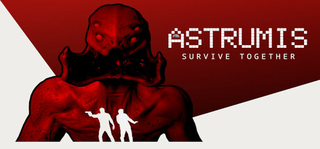
Astrumis - Survive Together is an exclusively co-op horror game. One player controls a survivor on an abandoned spaceship and the other the ship itself. They must work together to survive against the mysterious monster.
$9.99Mixed(136)
IndieHorrorCo-op Campaign
TyciMay 26, 2025