Scoring genre clarity...

Melon Man capsule

Melon Man

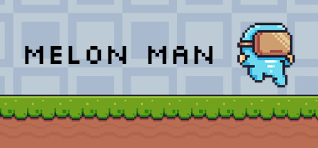
Do you like melons? How about a challenge? I must warn you, this game is not easy... Embark on a challenge playing as Melon Man. A charming 2D platformer that will test your platformer skills (and nerves).

Free to PlayPositive(26)
Precision Platformer2D PlatformerPlatformer
Blomma GamesJan 28, 2026

Melon Man scores 82/100 — better than 94% of Precision Platformer capsules (n=784).

Positive (26 reviews) · Free to Play · Released Jan 28, 2026 · By Blomma Games

Quick text summary

Melon Man scored 82/100 on Steam Analyzer — Good for a Precision Platformer capsule. Top priority fix: [contrast_color] Add deeper shadow values or darker background gradient zones to increase visual pop against Steam's dark theme and enhance small-size readability

Capsule scores by dimension

  • Genre Clarity: 9/10 — Pixel platformer immediately identifiable. The capsule communicates 2D platformer genre unmistakably through retro pixel art style, a charming protagonist character mid-jump in blue outfit, and classic green grass with brown dirt terrain at the bottom. At tiny size, the silhouette of the jumping character and blocky pixel aesthetic instantly signal platformer gameplay, exactly matching the game's casual challenge positioning.
  • Title Readability: 9/10 — Bold black text reads perfectly. MELON MAN is rendered in thick, clean black pixel font with generous letter spacing and substantial height on a light blue background tile pattern, ensuring excellent legibility at all sizes including tiny thumbnails. The stacked two-line layout with even margins prevents any crowding, and the font design maintains sharp edges that survive the squint test and grayscale conversion with no loss of clarity.
  • Contrast & Color: 8/10 — Strong light-to-dark value separation. Black title text pops distinctly against the light blue tile background, and the warm-toned brown/tan melon character head creates color separation from the cool blue body and background. The bright green grass stripe at the bottom grounds the composition with a warm contrast, though the overall palette stays relatively pastel-light and would benefit from slightly deeper shadow values to create more dramatic pop against Steam's dark #1b2838 background in actual context.
  • Uniqueness & Polish: 7/10 — Charming pixel craft with cohesive style. The character design is appealing and well-executed with smooth pixel animations implied by the posed jump, and the melon-themed protagonist (brown round head) provides a memorable hook that differentiates from generic platformers. The retro pixel aesthetic is polished and intentional, though the composition follows familiar indie platformer visual language rather than introducing a distinctive art direction or visual mechanic beyond the theme.
  • Brand Consistency: 8/10 — Retro pixel identity clearly reinforced. The capsule establishes a consistent and recognizable retro pixel art identity with unified color palette (warm browns, cool blues, primary greens) and a signature character silhouette that serves as an iconic brand mark. The melon-headed protagonist is distinctive enough to become recognizable across store assets, and the tiled background pattern reinforces a cohesive aesthetic language that would be consistent with other promotional materials.
  • Composition: 8/10 — Clear hierarchy with balanced focal point. The jumping character sits in the right-center as the primary focal point with appropriate breathing room, title text anchors the left side with strong visual weight, and the layered background (tiles, grass stripe, dirt) creates depth progression from front to back. At small and tiny sizes, the eye naturally reads title then character without scatter, though the tile pattern background is somewhat visually busy and could be simplified—the composition remains readable and resilient across all viewing scales with no critical elements endangered by edge cropping.

What works

  • Instant genre communication. Pixel art style, jumping protagonist, and classic platformer terrain immediately signal 2D platformer gameplay even at tiny thumbnail size.
  • Legible typography. Bold black pixel font on light blue background ensures title reads perfectly at all sizes with no loss of clarity during squint or grayscale tests.
  • Memorable character identity. The melon-headed protagonist is visually distinctive and charming, creating a recognizable brand mark that differentiates from generic platformers.
  • Balanced composition hierarchy. Title and character are well-positioned with clear focal hierarchy that guides eye naturally without clutter or competing elements.

What hurts the capsule

  • Busy background pattern. The repeating tile pattern creates visual noise that slightly competes with the main elements and dilutes composition impact at small sizes.
  • Soft color palette lacks punch. Pastel-light blues and warm tones are charming but may not pop dramatically against Steam's dark background #1b2838 in actual store context.
  • Generic platformer layout. While well-executed, the title-left character-right composition follows familiar indie platformer conventions rather than introducing distinctive visual layout innovation.

Priority fixes

  1. [contrast_color] Add deeper shadow values or darker background gradient zones to increase visual pop against Steam's dark theme and enhance small-size readability
  2. [composition] Simplify or replace the tile background pattern with a cleaner, less busy background to strengthen focal point emphasis on title and character
  3. [uniqueness_polish] Introduce a subtle visual element or effect that hints at the game's 'not easy' difficulty curve to add narrative depth beyond theme alone

Store copy priority fixes

  1. [feature_communication] Replace 'Juicy Gameplay: Jump and move your way with precision through a variety of levels' with specific mechanics, e.g., 'Master precision jumps, wall-slides, and mid-air timing across hand-crafted obstacle courses.' This clarifies what players will actually practice repeatedly.
  2. [uniqueness] Add a paragraph after the opening hook that articulates what Melon Man does differently—e.g., 'Unlike other platformers, Melon Man combines [specific mechanic] with [unique level design / aesthetic / progression].' Currently any platformer could use this copy.
  3. [audience_targeting] Clarify the difficulty curve in the short description: commit to 'Precision platformer for players who crave a hardcore challenge' or 'Accessible platformer with scalable difficulty,' not both. Ambiguity hurts conversion for both audiences.
  4. [feature_communication] Expand 'Catchy Tunes' to describe the soundtrack's role or style (e.g., 'Upbeat 8-bit soundtrack that syncs with level pacing, encouraging rhythm-based platforming')—currently it reads as filler.

Related guides

Steam app ID: 2928490 · Tags: Precision Platformer, 2D Platformer, Platformer, Cute, Funny