Scoring genre clarity...

Demon Slayer -Kimetsu no Yaiba- The Hinokami Chronicles 2 capsule

Demon Slayer -Kimetsu no Yaiba- The Hinokami Chronicles 2

Destroy demons with the power of forged bonds! Tanjiro Kamado's battle will once again unfold…

$59.99Very Positive(62)
AnimeMultiplayer3D Fighter
CyberConnect2Aug 5, 2025

Demon Slayer -Kimetsu no Yaiba- The Hinokami Chronicles 2 scores 87/100 — better than 99% of Anime capsules (n=1,560).

Very Positive (62 reviews) · $59.99 · Released Aug 5, 2025 · By CyberConnect2

Quick text summary

Demon Slayer -Kimetsu no Yaiba- The Hinokami Chronicles 2 scored 87/100 on Steam Analyzer — Excellent for a Anime capsule. Top priority fix: [title_readability] Increase subtitle outline weight and add slight background panel behind 'The Hinokami Chronicles 2' to maintain clarity at tiny size.

Capsule scores by dimension

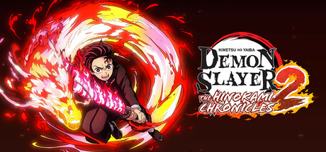
  • Genre Clarity: 9/10 — Anime action combat instantly clear. The large central character in dynamic combat pose with explosive red-orange fire effects immediately communicates action-adventure gameplay. At tiny size, the silhouette of the character mid-attack and the intense flame aura remain unmistakable, clearly signaling a combat-focused anime game. The visual language of shonen battle energy is unmistakable and genre-defining.
  • Title Readability: 8/10 — Logo readable but tagline fades small. The 'DEMON SLAYER' logo is bold, white, and positioned on a controlled dark background on the right side with solid contrast. The subtitle 'The Hinokami Chronicles 2' and Japanese text remain legible at small size due to size hierarchy and dark backdrop. At tiny size the main title holds but secondary text becomes soft, though the franchise name is still recognizable.
  • Contrast & Color: 9/10 — Vibrant fire effects pop dramatically. The bright red, orange, and yellow flame effects create strong value separation against the dark maroon-black background, with white highlights adding punch. The character's dark silhouette creates clear layering and depth that reads instantly in grayscale and at tiny sizes. This is premium contrast that rewards quick scrolling with immediate visual impact.
  • Uniqueness & Polish: 8/10 — High-quality anime rendering with polish. The character art is clean, detailed, and distinctly anime-styled with professional illustration quality matching the IP's visual standard. The particle effects and flame animation are coherent and purposeful, communicating the game's core mechanic of flame-based combat. This avoids generic template feel and delivers recognizable brand-premium presentation.
  • Brand Consistency: 9/10 — Strong Demon Slayer visual identity. The character design, clothing, weapon positioning, and art style are immediately recognizable to fans of the anime IP. The signature red and orange color palette tied to Tanjiro's flame breathing technique reinforces franchise identity without need for explanation. The visual language is consistent with official Demon Slayer marketing and visual canon.
  • Composition: 9/10 — Clear focal point with strong balance. The character occupies the left-center as the dominant focal point with the logo neatly positioned on the right, creating balanced asymmetry. The explosive fire effects radiate outward without cluttering, maintaining clear negative space and hierarchy. At small and tiny sizes this layout remains readable with no critical elements cut off by Steam cropping, and the eye naturally flows character-to-logo.

What works

  • Iconic character pose communicates action. The dynamic mid-combat silhouette instantly signals this is an action game, with weapon positioning and body language reinforcing the combat-driven experience.
  • Premium flame effects with intentional purpose. The red-orange-yellow particle system is visually cohesive and directly tied to the game's core flame breathing mechanic, adding narrative context beyond decoration.
  • Clean logo placement on controlled background. The 'DEMON SLAYER' text sits on a dark area with white outline and outline, ensuring full readability at all sizes without competing with the character.
  • Strong brand recognition for IP fans. The character design, outfit, and flame aesthetic are instantly recognizable to anyone familiar with Demon Slayer, creating immediate credibility and appeal.

What hurts the capsule

  • Secondary subtitle text loses clarity tiny. The 'The Hinokami Chronicles 2' and Japanese text become soft and difficult to parse at very small thumbnail sizes despite decent contrast.
  • Tagline 'Destroy demons with bonds' not visible. Any gameplay messaging or unique selling proposition text is absent from the visual, relying entirely on the character and IP recognition rather than communicating value.
  • Dark background limits color palette range. While the flame effects pop well, the surrounding dark areas could have used subtle supporting colors to add variety and visual interest without chaos.

Priority fixes

  1. [title_readability] Increase subtitle outline weight and add slight background panel behind 'The Hinokami Chronicles 2' to maintain clarity at tiny size.
  2. [composition] Add a subtle value gradient or accent color in lower left corner to balance the density of effects on the left side and improve visual weight distribution.
  3. [genre_clarity] Consider adding a small weapon or UI detail in the lower corner to reinforce the game's mechanics for players unfamiliar with the IP.

Store copy priority fixes

  1. [hook_strength] Rewrite the short description to lead with a gameplay verb and specific appeal: e.g., 'Master devastating combos as the Demon Slayer Corps' most powerful fighters—solo story, online versus, and competitive multiplayer await.'
  2. [feature_communication] Add a 1-2 sentence explanation of Dual Ultimates and Gear early in the About the Game section, clarifying how these mechanics enhance combat and distinguish this sequel.
  3. [uniqueness] Insert a paragraph comparing key improvements or new content versus the first Hinokami Chronicles (e.g., expanded story arcs, additional characters, refined combat system) to justify a sequel purchase.
  4. [tone_match] Reduce or relocate DLC/bonus disclaimers to a collapsed 'Editions & Bonuses' section, and rewrite the opening paragraphs in a more dynamic, action-focused voice that matches the anime's energy.

Related guides

Steam app ID: 2928600 · Tags: Anime, Multiplayer, 3D Fighter, Action, Adventure