Scoring genre clarity...
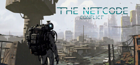
The Netcode Conflict is a community-event-driven online multiplayer game. Our goal is to develop and improve the game together with the community. We host regular events where players can win in-game rewards. TNC is still actively in development, and your ideas and feedback help shape its future!
Free to PlayMixed(26)
ExplorationLooter ShooterDriving
Patrick SiebarthDec 1, 2025