Scoring genre clarity...

Kenoma: Action Without Action capsule

Kenoma: Action Without Action

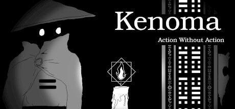
Answer the question of mortality in this sidescroller inspired by the adventures of old. Wander the depths of two parallel worlds. Confer with gods, locals, and other travelers. Solve problems through intuition and a collection of odd trinkets. Choose: death, or eternal life?

$9.994 user reviews
Interactive Fiction2DPhilosophical
Jack LevinDec 5, 2025

Kenoma: Action Without Action scores 78/100 — better than 93% of Interactive Fiction capsules (n=1,043).

4 user reviews · $9.99 · Released Dec 5, 2025 · By Jack Levin

Quick text summary

Kenoma: Action Without Action scored 78/100 on Steam Analyzer — Good for a Interactive Fiction capsule. Top priority fix: [title_readability] Increase tagline size or anchor it more prominently in the composition so 'Action Without Action' remains readable at TINY size without becoming a liability.

Capsule scores by dimension

  • Genre Clarity: 7/10 — Cinematic adventure with mystery. The silhouette of a cloaked figure with white eyes, geometric flame iconography, and architectural UI elements reading at TINY size clearly signal a stylized narrative adventure with supernatural or philosophical themes. The monochromatic aesthetic and mysterious protagonist pose suggest introspection and exploration rather than action combat, though the visual language is not immediately genre-specific enough to pinpoint 'adventure puzzle game' without context.
  • Title Readability: 8/10 — Clear serif title, readable tagline. The word 'Kenoma' in large, clean serif font reads perfectly at FULL, SMALL, and TINY sizes against the black background, with strong white-to-black contrast. The tagline 'Action Without Action' remains legible at SMALL size but becomes difficult to parse at TINY size due to smaller point size, though the main title strength compensates for this minor weakness.
  • Contrast & Color: 8/10 — Strong monochromatic high contrast. White and light gray elements (title, eyes, flame icon, character silhouette) separate cleanly from the black background across all viewing sizes, creating excellent value separation. The geometric flame symbol with white outline provides a clear focal point that reads well at TINY size, and the grayscale rendering maintains silhouette clarity even at minimal zoom.
  • Uniqueness & Polish: 8/10 — Distinctive art style, cohesive vision. The stark monochromatic aesthetic, geometric UI flourishes, and cloaked protagonist with angular design create a memorable and intentional visual identity that feels premium and distinct from typical indie adventure templates. The composition tells a story of mystery and contemplation rather than generic action, with careful craft evident in typography, symbol design, and the balance of minimalism with narrative suggestion.
  • Brand Consistency: 8/10 — Iconic character silhouette established. The cloaked figure with distinctive angular proportions and white eye circles is immediately recognizable and likely consistent across marketing materials and game screenshots. The monochromatic palette, geometric symbol language, and serif typography form a cohesive visual identity that would be recognizable on repeated exposure without relying on genre convention alone.
  • Composition: 8/10 — Balanced hierarchy, clear focal point. The left-positioned character silhouette anchors attention, with the title occupying the right-center space and the flame symbol providing a secondary focal point in the middle, creating effective depth layering and balance. Safe margins are respected at all sizes, and the composition remains readable at TINY size with the character, title, and central symbol all maintaining clear definition and separation.

What works

  • High-contrast monochromatic palette. White and light gray elements pop sharply against pure black, maintaining clarity and visual interest from FULL size down to TINY thumbnail.
  • Memorable protagonist silhouette. The cloaked figure with distinctive proportions and white eyes creates an iconic, recognizable character identity that stands apart from generic adventure templates.
  • Clear visual storytelling. Geometric flame symbolism, philosophical tagline, and mysterious aesthetic communicate the game's introspective, contemplative core without relying on action-game visual clichés.
  • Balanced composition across sizes. Left-aligned character, centered title, and mid-field symbol create depth and focal hierarchy that reads effectively at SMALL and TINY viewing conditions.

What hurts the capsule

  • Tagline readability at thumbnail size. 'Action Without Action' becomes illegible at TINY size due to reduced point scale, potentially obscuring the game's unique selling proposition on quick scrolls.
  • Limited visual warmth or accent color. The purely monochromatic approach, while stylish, lacks a secondary accent color that might draw additional eye focus or add visual dynamism at quick-scroll speeds.
  • Architectural elements feel decorative. The UI-style building elements on the right side of the capsule add visual clutter without directly reinforcing genre or mechanic clarity, potentially diluting the focal point at SMALL size.

Priority fixes

  1. [title_readability] Increase tagline size or anchor it more prominently in the composition so 'Action Without Action' remains readable at TINY size without becoming a liability.
  2. [contrast_color] Test a subtle accent color (deep gold or cyan) applied sparingly to the flame symbol or title underline to add visual pop without breaking monochromatic cohesion.
  3. [composition] Reduce or simplify the architectural building elements on the right edge to prevent visual competition and clarify the primary subject focus at SMALL thumbnail viewing.

Store copy priority fixes

  1. [hook_strength] Rewrite the opening line to front-load the core mechanic with emotional stakes: 'Explore two parallel worlds—one where death is inevitable, one where it never comes. Your choice will reshape reality itself.' This leads with the unique system and existential dilemma together.
  2. [feature_communication] Add one sentence after the world-building paragraph that explicitly defines 'action without action' as 'puzzle-solving without combat—progress through wit, conversation, and the odd trinkets you collect, not violence.' This removes ambiguity about gameplay loop.
  3. [audience_targeting] Insert a sentence after the first detailed paragraph targeting the core audience: 'If you love philosophical narratives, mind-bending puzzles, and games where talking matters as much as doing, Kenoma is built for you.' This creates immediate resonance with the right player.
  4. [uniqueness] Add a sentence that concretely differentiates from other narrative-puzzle games: 'Unlike linear adventure games, the two-world system means you design your own puzzle solutions by choosing which half to develop and which to sacrifice.' This articulates what is distinctly different.

Related guides

Steam app ID: 2933260 · Tags: Interactive Fiction, 2D, Philosophical, Surreal, Story Rich