Scoring genre clarity...

Valor & Blade capsule

Valor & Blade

Souls-Inspired Dungeon Crawler. End the Cycle. Master the Blade.

$4.994 user reviews
Souls-likeDifficultAction RPG
TechGladiatorJan 13, 2026

Valor & Blade scores 82/100 — better than 92% of Souls-like capsules (n=429).

4 user reviews · $4.99 · Released Jan 13, 2026 · By TechGladiator

Quick text summary

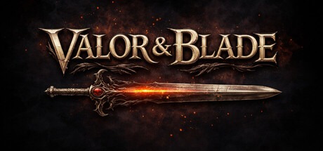
Valor & Blade scored 82/100 on Steam Analyzer — Good for a Souls-like capsule. Top priority fix: [uniqueness_polish] Add a subtle but distinctive visual element or symbol (crest, rune, motif) that can become a recognizable brand anchor across all marketing materials and store assets.

Capsule scores by dimension

  • Genre Clarity: 8/10 — Strong action-fantasy RPG signals. The ornate medieval sword with glowing orange energy clearly communicates melee combat focus and fantasy setting. At TINY size, the blade silhouette and warm glow immediately read as action-adventure, with the decorative hilt reinforcing high-fantasy RPG expectations. The particle effects around the sword strengthen the magical combat theme without obscuring genre intent.
  • Title Readability: 9/10 — Excellent legibility across all sizes. The title 'VALOR & BLADE' uses a bold serif font with a distinctive ampersand in the center, ensuring clear readability at FULL, SMALL, and TINY sizes. The golden-cream letterforms have strong value contrast against the dark background with subtle glowing outline enhancing separation. At TINY size the letter forms remain distinct and the title does not collapse, making it instantly recognizable.
  • Contrast & Color: 9/10 — Excellent value and silhouette separation. The warm golden title and bright orange-white sword energy create strong visual separation against the near-black background (#1b2838). Grayscale evaluation shows crisp silhouette clarity of the blade with the hot orange glow providing extreme value contrast. The dark smoke and particle field in the background recede appropriately, ensuring the sword and title remain the dominant focal points.
  • Uniqueness & Polish: 8/10 — Premium craft with iconic weapon focus. The capsule demonstrates intentional visual storytelling by centering an ornate, glowing sword rather than a generic character pose—this directly supports the 'Master the Blade' tagline and differentiates from typical action RPG templates. The golden ornamental hilt design and carefully controlled particle effects convey high production value, though the dark smoky background is a familiar convention in the genre that limits distinctiveness slightly.
  • Brand Consistency: 7/10 — Coherent fantasy aesthetic, limited iconic recall. The golden serif typography, warm orange-gold color palette, and ornate medieval weaponry create a consistent high-fantasy brand voice that should carry through promotional materials. However, without access to the 6 store screenshots or a distinctive character/symbol that appears across assets, the brand identity reads as competent but not yet iconic—the sword itself is the primary memorable anchor, though ornate blades are common in the genre.
  • Composition: 8/10 — Strong horizontal balance with clear focal point. The sword is centered horizontally and positioned in the upper-middle area, creating an intentional focal point that guides attention effectively at all sizes. The title sits below in the lower half, creating natural depth layering: foreground title, midground sword, background particles. Safe margins are respected and the composition remains legible at SMALL and TINY sizes without edge-hugging elements being cropped.

What works

  • Title remains legible at tiny size. The bold serif 'VALOR & BLADE' with strong golden contrast and minimal decorative detail maintains clarity even when viewed as a small thumbnail.
  • Iconic weapon as central hero element. Focusing on an ornate, glowing sword rather than a character conveys the game's blade-mastery core mechanic and differentiates from generic action RPG templates.
  • Excellent value contrast and depth. The warm sword glow and golden text pop sharply against the dark background while particle effects create layered depth without cluttering the focal point.
  • Clear visual hierarchy at all scales. The composition maintains effective focal point and readability from FULL size down to TINY thumbnails without information loss or confusion.

What hurts the capsule

  • Generic dark smoky background. The background particle field and dark tone are well-executed but follow familiar conventions in souls-like and action RPG capsules, reducing visual distinctiveness.
  • Limited brand identity beyond the sword. Without a visible character, symbol, or signature motif beyond the ornate blade, the capsule may lack memorable brand recall compared to top-tier competitors with iconic mascots or distinctive visual signatures.
  • No visible tagline or gameplay hint. While 'End the Cycle. Master the Blade.' is part of the game description, it does not appear on the capsule itself, missing an opportunity to reinforce the unique value proposition visually.

Priority fixes

  1. [uniqueness_polish] Add a subtle but distinctive visual element or symbol (crest, rune, motif) that can become a recognizable brand anchor across all marketing materials and store assets.
  2. [composition] Integrate the tagline 'End the Cycle' or 'Master the Blade' as a subtle text accent below or beside the title to reinforce the souls-inspired dungeon crawler positioning.
  3. [brand_consistency] Cross-reference the 6 store screenshots to ensure the sword design, color palette, and golden typography appear consistently; refine any divergent brand cues to create stronger recognition.

Store copy priority fixes

  1. [hook_strength] Rewrite the short description to lead with the procedural dungeon + consistent encounters mechanic: 'Souls-inspired roguelike where the dungeon reshapes but enemies never change—master through repetition, not grinding.'
  2. [uniqueness] Add a sentence to the opening that explicitly contrasts this approach with traditional Souls-likes and roguelikes: e.g., 'Unlike procedural roguelikes, enemy encounters remain consistent, rewarding pattern recognition over adaptability to new threats.'
  3. [tone_match] Enhance atmospheric language in the detailed description to match the 'Dark Fantasy, Atmospheric' tags; e.g., replace 'gothic dungeon' with more evocative sensory details about the cursed environment.

Related guides

Steam app ID: 2941900 · Tags: Souls-like, Difficult, Action RPG, RPG, 3D