Scoring genre clarity...
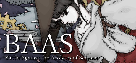
A story-driven 2D bullet hell shooter set in the afterlife. An emotional journey of young heroines as they confront the science worshippers known as "Chemistians" Vibrant pixel art vividly portrays the world and narrative. "Welcome to 'The Crystal Palace'..."
Free to Play9 user reviews
Bullet HellSide ScrollerShoot 'Em Up
GuriiEcoGamesJun 18, 2025