Dice 'n Goblins scores 68/100 — better than 17% of Turn-Based Strategy capsules (n=1,225).

Quick text summary

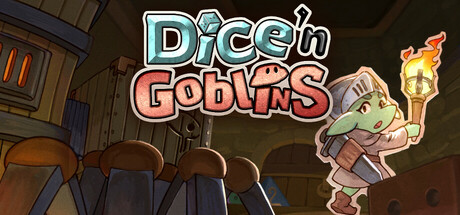
Dice 'n Goblins scored 68/100 on Steam Analyzer — Solid for a Turn-Based Strategy capsule. Top priority fix: [uniqueness_polish] Introduce a visible dice element—either held by the goblin, glowing near the torch, or as a subtle motif—to visually communicate the core turn-based mechanic and create visual distinction from generic fantasy RPGs.

Capsule scores by dimension

  • Genre Clarity: 7/10 — Fantasy RPG clear, dice mechanic implied. The goblin character with magical torch and whimsical art style immediately signals fantasy RPG. The title 'Dice 'n Goblins' reinforces the turn-based dice mechanic core to gameplay. At TINY size, the goblin silhouette and fantasy setting remain readable, though the dice element requires text recognition rather than visual iconography alone.
  • Title Readability: 8/10 — Bold stylized lettering reads well at all sizes. The title uses a chunky, high-contrast white and colored outline font that maintains legibility at SMALL and TINY sizes. The two-line layout with 'Dice 'n' above 'Goblins' is well-spaced and positioned on a semi-clear background area above the busy scene. The white outline on pastel fills ensures it separates from the darker scene below, though at TINY size some fill color variation becomes harder to distinguish.
  • Contrast & Color: 7/10 — Good separation with warm indie palette. The goblin character uses pale green skin, pink clothing, and warm orange torch flame that all contrast reasonably against the dark brown tavern interior and Steam background. The title's white outline and pastel fills pop against the background effectively. At TINY size the overall warm-cool separation holds, though fine color distinctions in the character become muddy and the mid-tone browns in the environment compress into near-silhouette.
  • Uniqueness & Polish: 6/10 — Competent indie charm, somewhat generic tavern scene. The art style is clean cartoon illustration with appealing character design and color work that feels intentional and polished. However, the tavern interior with wooden furniture and torch is a familiar indie game backdrop without a strong unique hook beyond the cute goblin. The execution is solid and craft-evident, but the scene doesn't communicate a distinctive mechanic or memorable selling point that separates it from other turn-based RPGs.
  • Brand Consistency: 6/10 — Consistent art style, limited iconic identity signals. The capsule demonstrates coherent cartoon rendering, consistent color palette of warm earth tones and pale greens, and a recognizable character style that would likely be consistent across store screenshots. However, there are no distinctive visual symbols, unique goblin variants, or signature dice-themed motifs that create a memorable brand signature beyond 'cute goblin fantasy RPG.' The presentation is internally cohesive but relies on the title text rather than visual recognition alone.
  • Composition: 7/10 — Clear focal point, well-balanced layout. The goblin character anchors the right-center composition with the torch providing a secondary warm accent point. The title sits cleanly in the upper half with good breathing room, and the tavern interior below provides environmental context without overwhelming the focal subject. At SMALL and TINY sizes the character silhouette reads clearly as the primary focus, though at TINY the tavern furniture becomes distracting visual noise in the lower half.

What works

  • Strong title typography and placement. The chunky outline font with pastel fills maintains excellent readability across all sizes from FULL down to TINY, positioned on a semi-clear region that separates it from the scene below.
  • Clear character focal point and appeal. The goblin character is charming, well-rendered, and immediately reads as the primary subject even at thumbnail size, with warm torch accent providing compositional balance.
  • Coherent warm color harmony. The palette of warm oranges, browns, greens, and pinks creates visual unity and indie game warmth that contrasts effectively against the dark Steam background.

What hurts the capsule

  • Generic tavern setting lacks unique hook. The wooden furniture and torch interior is a familiar trope that doesn't visually communicate the game's dice-based strategy mechanic or distinctive gameplay twist.
  • Limited memorable brand iconography. The capsule relies entirely on the title text to explain the dice element; no visual symbol, dice motif, or unique goblin variant creates instant recognition beyond 'cute fantasy RPG.'
  • Environmental clutter at thumbnail scale. The tavern furniture and background chairs create mid-tone visual noise at TINY size that competes with the character focal point when scrolling quickly.

Priority fixes

  1. [uniqueness_polish] Introduce a visible dice element—either held by the goblin, glowing near the torch, or as a subtle motif—to visually communicate the core turn-based mechanic and create visual distinction from generic fantasy RPGs.
  2. [composition] Reduce or soften background tavern furniture or use selective contrast to push chairs into deeper shadow, allowing the goblin and torch to read more clearly as isolated focal points even at TINY size.
  3. [brand_consistency] Develop a signature goblin character variant or visual symbol (coin, dice icon, magical aura) that becomes iconic and recognizable across marketing and store screenshots to build brand memory.

Store copy priority fixes

  1. [hook_strength] Rewrite the short description opening to lead with the unique dice-manipulation mechanic: 'Control your fate with dice—re-roll mid-combat, transform dice into weapons, and chain combos no RNG can stop' rather than the generic 'blends luck and strategy'.
  2. [uniqueness] Add a differentiator sentence to the detailed description such as: 'Your dice pool is your identity—no two playthroughs feel the same as you build from 60+ unique dice and combine them with 22 powerful skills' to position the customization as the core hook.
  3. [tone_match] Restructure the feature list to match the narrative tone by using active storytelling ('As you descend, you'll discover over 50 monster types...') instead of static bullet points, or move the bulleted list to a separate 'What You'll Get' section to reduce tonal whiplash.

Related guides

  • Steam page optimisationCapsule, copy, screenshots, tags — the full Steam page conversion stack.
  • Steam tags guideTag selection, ordering, and how it shapes Steam's recommendation rails.

Steam app ID: 2945950 · Tags: Turn-Based Strategy, RPG, Dice, Dungeon Crawler, Grid-Based Movement