Scoring genre clarity...
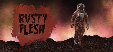
Rusty Flesh is a sci-fi horror puzzle platformer for the Game Boy Color where you switch gravity instead of jumping. Explore the different areas of a derelict spaceship putting together all the pieces of its lovecraftian mistery, and enjoy its retro-futuristic aesthetics.
$7.992 user reviews
Puzzle PlatformerRetroHorror
Wasteland GamesJun 30, 2025