Scoring genre clarity...

Jordi & Oslo: The Lost Tail capsule

Jordi & Oslo: The Lost Tail

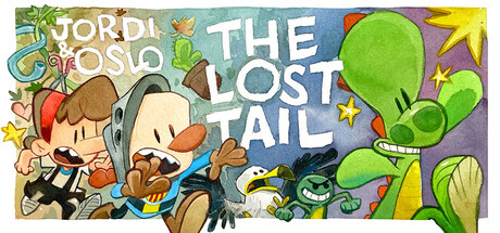
Jordi & Oslo and the Lost Tail is a humorous point and click adventure game. Explore beautiful watercolour- painted locations, interact with quirky characters, and solve witty puzzles to help Jordi and Sigrid investigate the disappearance of their missing friend Oslo.

Point & ClickFemale Protagonist2D
De Falces2027

Jordi & Oslo: The Lost Tail scores 73/100 — better than 54% of Point & Click capsules (n=1,689).

Released 2027 · By De Falces

Quick text summary

Jordi & Oslo: The Lost Tail scored 73/100 on Steam Analyzer — Good for a Point & Click capsule. Top priority fix: [composition] Reduce decorative star and icon density; consolidate secondary elements (alien, UI symbols) to the edges to create a cleaner focal pyramid with the character duo as undisputed primary anchor.

Capsule scores by dimension

  • Genre Clarity: 8/10 — Clear adventure game with character focus. The capsule immediately communicates a colorful, character-driven adventure through the prominent cartoon duo (Jordi and Oslo) in the left-center, their expressive poses, and the whimsical art style. At TINY size, the distinctive character silhouettes and playful tone remain readable, though the specific genre (point-and-click adventure) is inferred from style rather than explicit UI hints. The bright, hand-drawn aesthetic aligns well with indie adventure expectations and the watercolor painting quality mentioned in the description.
  • Title Readability: 7/10 — Title readable but composition creates tension. The title 'JORDI & OSLO THE LOST TAIL' uses clean, legible white lettering split across the upper portion with good contrast against the multicolored background. At SMALL size it reads clearly, but at TINY size the split layout and letter density make it slightly harder to parse in a single glance. The large character illustrations in the center occupy space that could have been used for tighter title placement, creating some visual competition for attention.
  • Contrast & Color: 8/10 — Vibrant palette with strong silhouette separation. The capsule uses a bright, saturated color palette—lime green alien/creature on the right, warm brown and cream for the character duo, turquoise and purple backgrounds—that pops cleanly against Steam's dark gray background. The characters and key elements maintain clear silhouettes even at TINY size, and the value separation between foreground figures and background is strong. Grayscale test shows good tonal range; no muddy mid-tone collapse.
  • Uniqueness & Polish: 7/10 — Charming art style, moderate narrative distinctiveness. The hand-drawn, cartoonish watercolor aesthetic is well-executed and feels intentional, with quirky character designs and a cohesive visual language that signals indie adventure craft. However, the composition—two characters, a colorful alien, scattered stars and UI icons—reads as a competent but somewhat familiar 'wacky adventure duo' template rather than a specific unique hook. The art quality is solid, but the visual storytelling does not yet reveal the core mechanic or distinctive selling point that would elevate it to premium tier.
  • Brand Consistency: 7/10 — Coherent character and palette identity. The capsule establishes a clear and consistent art direction: expressive cartoon characters, warm cream/brown and cool teal/purple color pairing, playful UI embellishments (stars, icons), and a lighthearted tone. The duo's design and the lime-green alien are visually distinctive enough to become recognizable identity cues. Without access to the 7 store screenshots, internal cohesion appears strong across colors, rendering style, and character appeal, but there is no single iconic symbol or motif that dominates memory.
  • Composition: 7/10 — Balanced but slightly cluttered focal hierarchy. The composition places the character duo on the left-center as the primary focal point, the green alien on the right as secondary interest, and scattered decorative stars and icons throughout. At SMALL and TINY sizes, the two main characters read as the primary subject, and supporting elements guide without overwhelming. However, at TINY size the overall density of decorative elements (stars, small character silhouettes) slightly dilutes focus, and the right-side alien—though eye-catching—competes visually with the title area. Safe margins appear adequate; no critical edge cropping risk detected.

What works

  • Strong character appeal and charm. The expressive, well-drawn duo and quirky alien design immediately signal a personality-driven adventure game and establish emotional investment.
  • Vibrant, cohesive color palette. The warm-cool color balance and saturated hues create strong visual separation from the Steam dark background and maintain readability at small sizes.
  • Clear readable title and readable tagline placement. White title text with consistent letter sizing and placement ensures the game name stands out and can be parsed at SMALL size without excessive strain.

What hurts the capsule

  • Decorative clutter reduces focal clarity. Scattered stars, small icons, and the secondary green alien create visual noise that dilutes the primary focus on the main character duo, especially at TINY size.
  • Generic adventure composition template. The layout—two characters plus colorful sidekick—follows a familiar indie adventure trope without a distinctive compositional or mechanical hook that signals what makes this game unique.
  • Title split across background regions. The split 'JORDI & OSLO' / 'THE LOST TAIL' layout across different visual zones creates slight reading friction and reduces impact compared to a unified, centered approach.

Priority fixes

  1. [composition] Reduce decorative star and icon density; consolidate secondary elements (alien, UI symbols) to the edges to create a cleaner focal pyramid with the character duo as undisputed primary anchor.
  2. [uniqueness_polish] Emphasize a distinctive visual hook (e.g., highlight a signature prop, puzzle element, or environment detail) that communicates the core adventure mechanic or unique story angle beyond generic character-driven adventure.
  3. [title_readability] Unify the title into a single horizontal line or block placement at the top or bottom to reduce parsing time at TINY size and improve visual weight hierarchy.

Store copy priority fixes

  1. [feature_communication] Rewrite the garbled middle section entirely. Replace 'beat an indefense wooden log' and 'explode untidy rooms' with clear, actual gameplay examples. Clarify what 'examining clues until characters say something funny' means mechanically.
  2. [feature_communication] Restructure the '5x game' bullet points to show how each mechanic serves the core goal of solving the mystery. Example: 'Exchange items between characters' inventories to solve puzzles only one person can solve.'
  3. [hook_strength] Add one specific detail about the missing dragon or the mystery's stakes in the short description to make the hook more memorable than generic 'witty puzzle' language.
  4. [uniqueness] Promote the comic-strip connection earlier in the detailed description rather than burying it at the end; this is the game's strongest differentiator.

Related guides

Steam app ID: 2966330 · Tags: Point & Click, Female Protagonist, 2D, Cute, Comic Book