Scoring genre clarity...

Cards and Dungeons capsule

Cards and Dungeons

A roguelike dungeon crawler where every card you play brings power… and punishment. Descend through shifting floors, face brutal bosses, and grow stronger run after run.

$9.99Positive(17)
Action RoguelikeHack and SlashRoguelite
Family DevsMar 5, 2026

Cards and Dungeons scores 72/100 — better than 43% of Action Roguelike capsules (n=1,675).

Positive (17 reviews) · $9.99 · Released Mar 5, 2026 · By Family Devs

Quick text summary

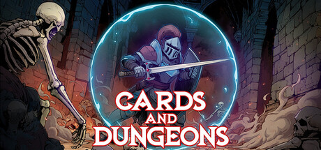
Cards and Dungeons scored 72/100 on Steam Analyzer — Good for a Action Roguelike capsule. Top priority fix: [genre_clarity] Integrate visual card elements (card outline, glowing rune, or deck icon) into the center composition to reinforce the card-deck core mechanic and differentiate from generic dungeon imagery.

Capsule scores by dimension

  • Genre Clarity: 7/10 — Roguelike dungeon action clear. The skeleton and armored knight at left immediately signal dungeon combat, while the card-game aesthetic through the neon circle framing hints at deck-building mechanics. At tiny size, the dungeon setting and combat poses remain readable, though the card-specific gameplay hook becomes less obvious without the title text.
  • Title Readability: 8/10 — Title stands out clearly. White serif text "CARDS AND DUNGEONS" centered in a bright cyan neon circle provides strong contrast against the dark background and competing scene elements. At tiny size, the text remains legible due to the solid background ring supporting it, though the secondary tagline below becomes illegible at that scale.
  • Contrast & Color: 8/10 — Strong neon pop against dark. The bright cyan neon circle and white title text create excellent value separation from the #1b2838 background, while the skeleton skull and warm orange-red brick architecture add depth layering. At small and tiny sizes, the neon outline and white text maintain clear silhouettes; grayscale conversion confirms strong tonal separation without muddy mid-tones.
  • Uniqueness & Polish: 7/10 — Stylish but derivative neon framing. The cyberpunk neon circle aesthetic paired with medieval dungeon elements creates visual interest, and the skeleton-knight composition suggests the roguelike tone effectively. However, the neon-circle framing device feels familiar in indie game marketing, and the scene lacks a distinctive mechanical or narrative hook that would elevate it above competent genre pastiche.
  • Brand Consistency: 6/10 — Coherent but generic art style. The gothic dungeon palette, skeletal imagery, and card-game neon frame are internally consistent and support a dark-fantasy roguelike identity. Without additional reference to the 10 store screenshots, the visual language reads as solid genre work but lacks a signature motif or iconic character that would make the brand immediately recognizable later.
  • Composition: 7/10 — Clear focal point, minor edge risks. The cyan neon circle centered on the image creates a strong primary focal point, with the skeleton on the left and armored figure on the right balancing the frame. The title sits safely within the neon ring at all sizes; however, the skeleton skull extends into the left edge and the armored knight into the right edge, creating minor crop vulnerability on ultrawide or cropped displays.

What works

  • Neon title contrast. The bright cyan outline and white serif text create excellent legibility against the dark background and maintain readability at tiny thumbnail size.
  • Clear dungeon setting. Brick architecture, skeleton, and armored knight immediately communicate dungeon roguelike combat and establish tone without ambiguity.
  • Layered depth composition. Multiple foreground and background elements (skeleton left, character center, architecture right) create visual hierarchy that guides the eye effectively.

What hurts the capsule

  • Generic neon framing device. The cyan circle aesthetic, while effective, mimics common indie cyberpunk/synthwave design trends and lacks distinctive visual signature.
  • Card mechanic underemphasized. The deck-building core mechanic is mentioned in the title but not visually communicated through icons, card imagery, or mechanical cues in the scene.
  • Edge-hugging subject elements. The skeleton skull and armored character extend too close to left and right edges, risking crop loss on some display aspects or thumbnails.

Priority fixes

  1. [genre_clarity] Integrate visual card elements (card outline, glowing rune, or deck icon) into the center composition to reinforce the card-deck core mechanic and differentiate from generic dungeon imagery.
  2. [composition] Pull the skeleton and knight inward by 8-12% to establish safe margins and reduce edge vulnerability without losing the balanced two-figure composition.
  3. [uniqueness_polish] Develop a signature visual motif or color accent (beyond neon) that appears consistently across store assets to strengthen brand recognition and distinction within the roguelike indie space.

Store copy priority fixes

  1. [feature_communication] Add 1-2 concrete examples of punishment outcomes (e.g., 'lose 20% max health,' 'skip your next turn,' 'unlock a dangerous elite modifier') to make the risk mechanic tangible and memorable.
  2. [genre_clarity] Clarify the action-card play hybrid in one sentence—specify whether the game is real-time isometric combat with card-slots, turn-based tactical combat, or rhythm-based action, so players know what to expect in a run.
  3. [uniqueness] Add 1-2 sentences explaining how the punishment counter forces strategic trade-offs that are unique to Cards and Dungeons compared to other roguelikes (e.g., 'forcing you to choose between immediate power and long-term survival').
  4. [audience_targeting] Mention difficulty options or confirm 'brutal difficulty' is the only mode, so newer players or those seeking story-light gameplay know whether to buy.

Related guides

Steam app ID: 2968290 · Tags: Action Roguelike, Hack and Slash, Roguelite, Perma Death, Action RPG