Scoring genre clarity...
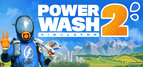
PowerWash Simulator 2 capsule

PowerWash Simulator 2

PowerWash Simulator is back, bubbling with fresh locations, soap-erior equipment and splashy features. Effortlessly transform soiled surroundings into clean, serene scenes, solo or with pals. Satisfaction is a spray away!

$18.74Very Positive(292)
CasualCleaningSimulation
FuturLabOct 23, 2025

PowerWash Simulator 2 scores 87/100 — better than 98% of Casual capsules (n=10,512).

Very Positive (292 reviews) · $18.74 · Released Oct 23, 2025 · By FuturLab

Quick text summary

PowerWash Simulator 2 scored 87/100 on Steam Analyzer — Excellent for a Casual capsule. Top priority fix: [brand_consistency] Add subtle signature visual motif or icon (soap bubbles, water droplets, or cleanliness indicator) that becomes a recurring brand symbol across marketing materials

Capsule scores by dimension

  • Genre Clarity: 9/10 — Instantly recognizable simulation game. The large orange and blue pressure washer with spray nozzle and distinctive tank design immediately communicates a cleaning/power washing mechanic at any size. The pristine landscape transformation from soiled to clean, combined with the equipment-focused character pose, clearly signals a casual simulation game focused on satisfaction through restoration.
  • Title Readability: 9/10 — Bold, clear, highly legible text. The white sans-serif title 'POWER WASH' is large, high-contrast against the blue sky background, and completely readable at TINY size. The 'SIMULATOR 2' subtitle with the orange '2' bubble maintains clarity without competing for attention, and the layout positions the text safely away from edges.
  • Contrast & Color: 9/10 — Strong value separation and pop. The bright orange and blue character equipment creates excellent silhouette contrast against the blue-green landscape background and maintains clear separation in grayscale. The white title pops decisively against the sky, and warm orange accents guide the eye without muddying the overall composition.
  • Uniqueness & Polish: 8/10 — Polished, cohesive, thematic presentation. The capsule features clean vector-like rendering of the pressure washer character with intentional color blocking (blue suit, orange equipment) that feels premium and deliberate. The progression from urban cityscape to pristine mountain landscape visually communicates the core gameplay loop of transformation, though the overall approach is recognizable within the simulation genre rather than entirely novel.
  • Brand Consistency: 8/10 — Strong identity through equipment design. The distinctive orange and blue pressure washer character with its iconic tank and nozzle design serves as a memorable brand identifier that would be recognizable across marketing materials. The warm orange and cool blue palette is consistent and distinctive, though the landscape background could be interpreted as more generic than character-driven branding.
  • Composition: 9/10 — Excellent hierarchy and focal balance. The pressure washer character is positioned prominently in the left-center foreground with clear dominance, the title sits in controlled upper-right space with strong hierarchy, and the background landscape provides depth without cluttering the read. The composition maintains strong focal clarity at SMALL and TINY sizes, with no competing elements and safe margins preventing crop loss.

What works

  • Iconic equipment design. The orange and blue pressure washer is instantly recognizable and memorable, clearly communicating the game's core mechanic at any viewing size.
  • High contrast legibility. White title and orange accents create strong visual pop against the blue sky background and maintain excellent readability at tiny thumbnail size.
  • Clear visual narrative. The landscape progression from urban to pristine scenery effectively communicates the satisfaction-driven gameplay loop of restoration and cleaning.
  • Balanced composition. Strong focal point hierarchy with the character dominating the left side while title and background elements support without competing for attention.

What hurts the capsule

  • Generic landscape background. The mountain and cityscape backdrop, while pretty, feels somewhat standard and could be replaced with more gameplay-specific or thematic environmental storytelling.
  • Limited brand extension clarity. While the equipment is distinctive, there are few additional visual identity markers that would make this recognizable as PowerWash Simulator 2 specifically versus a generic cleaning simulation.

Priority fixes

  1. [brand_consistency] Add subtle signature visual motif or icon (soap bubbles, water droplets, or cleanliness indicator) that becomes a recurring brand symbol across marketing materials
  2. [uniqueness_polish] Enhance the 'before/after' transformation story by showing contrasting textures or visible dirt/grime elements in the background to strengthen the satisfaction narrative

Store copy priority fixes

  1. [feature_communication] Add 1-2 sentences describing what home-base customization and cat companions unlock or reward (e.g., 'Collect unlocked furniture from jobs and decorate your base to show off your cleaning prowess and share progress with friends').
  2. [uniqueness] Explicitly state what is new in PowerWash Simulator 2 vs. the original in the opening section (e.g., 'Featuring 50+ new jobs, online co-op progression, and multi-stage locations you won't find in the first game').
  3. [hook_strength] Move the Adventure Time Pack content to a secondary callout box or the end of the detailed description to avoid burying the base game's core appeal in players' first read.

Related guides

Steam app ID: 2968420 · Tags: Casual, Cleaning, Simulation, Relaxing, Local Multiplayer