Scoring genre clarity...

DRFT capsule

DRFT

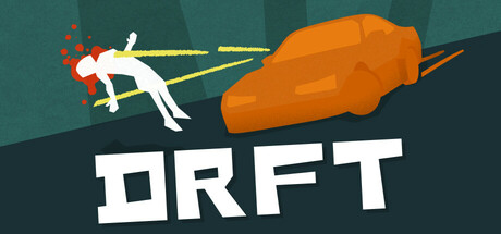
DRFT is a physics-based arena shooter. Weaponize the raw momentum of every drift to supercharge into an invulnerable wrecking ball. Shred waves of foes and bounce off walls to survive. Between runs, stack upgrades to turn your hard-to-handle hatchback into a screen-clearing machine of destruction.

$4.99Positive(13)
Action RoguelikeArena ShooterReplay Value
Big Bang StudioMar 9, 2026

DRFT scores 82/100 — better than 94% of Action Roguelike capsules (n=1,675).

Positive (13 reviews) · $4.99 · Released Mar 9, 2026 · By Big Bang Studio

Quick text summary

DRFT scored 82/100 on Steam Analyzer — Good for a Action Roguelike capsule. Top priority fix: [brand_consistency] Introduce a signature visual motif or character trait (e.g., distinctive hatchback silhouette detail or unique damage effect) that becomes recognizable across all marketing materials

Capsule scores by dimension

  • Genre Clarity: 8/10 — Physics action shooter immediately clear. The stylized character in mid-drift pose with dynamic momentum lines and explosive impact against an orange obstacle clearly communicates action and physics-based gameplay. At tiny size, the silhouette of the drifting figure and collision effect still read as kinetic combat, though the specific 'arena shooter' subgenre becomes slightly less distinct without text reinforcement.
  • Title Readability: 9/10 — Bold white title highly legible. DRFT appears in large, clean white sans-serif lettering with excellent contrast against the dark teal background and strong anchor at bottom center. The title remains fully readable at small and tiny sizes due to thick letterforms and strategic placement on a neutral background region away from visual clutter.
  • Contrast & Color: 9/10 — Strong value separation and silhouette. The white character figure, bright yellow momentum lines, and saturated orange obstacle create clear visual separation against the dark teal background. Even in grayscale, the light-mid-dark value hierarchy maintains strong edge definition and readability at all sizes, with the character silhouette remaining distinct during quick scroll.
  • Uniqueness & Polish: 8/10 — Distinctive physics action hook. The capsule communicates a unique core mechanic through visual storytelling—the drifting pose, momentum visualization, and collision payload clearly differentiate this from generic shooters. The crafted illustration style and intentional effect design feel premium and polished, though the overall concept remains within familiar indie game presentation norms.
  • Brand Consistency: 7/10 — Coherent visual style, limited identity. The capsule uses consistent rendering with clean vector illustration, bold contrast, and a unified teal-and-orange palette that supports the action theme. However, there are no strongly iconic character traits, signature symbols, or distinctive branding elements that would make DRFT immediately recognizable in future marketing without the title text.
  • Composition: 8/10 — Clear hierarchy with confident layout. The composition balances a strong focal point (drifting character and orange obstacle center-right) with supporting momentum lines that guide the eye leftward, creating dynamic visual flow. The title anchors at bottom center with safe margins, and all key elements remain within safe framing across thumbnail sizes; the layered background adds depth without competing for attention.

What works

  • Readable title at all sizes. DRFT's white sans-serif lettering maintains legibility from full header down to tiny thumbnail due to thick strokes and placement on neutral background.
  • Dynamic momentum communication. Yellow directional lines and the drifting pose effectively convey physics-based action gameplay at a glance, supporting quick genre recognition.
  • Strong color-value contrast. Bright orange obstacle and white character pop clearly against dark teal background, ensuring silhouette clarity even under scrolling and squint conditions.

What hurts the capsule

  • Limited brand identity markers. The capsule lacks memorable character design or iconic visual symbols that would distinguish DRFT from other indie action games in recall scenarios.
  • Generic teal palette choice. While functional, the teal background is common in indie game marketing and does not establish distinctive visual ownership for the brand.

Priority fixes

  1. [brand_consistency] Introduce a signature visual motif or character trait (e.g., distinctive hatchback silhouette detail or unique damage effect) that becomes recognizable across all marketing materials
  2. [uniqueness_polish] Consider adding a subtle secondary color accent or stylistic flourish that creates visual distinction from comparable physics-action indie titles

Store copy priority fixes

  1. [feature_communication] Remove the verbatim repetition of the short description at the top of the detailed section and replace it with a hook that expands on 'why this fusion of car physics and arena combat is fresh'—e.g., 'Every drift is an attack. Every bounce is an escape. DRFT fuses vehicular momentum with roguelite combat in ways other shooters don't attempt.'
  2. [audience_targeting] Add a sentence clarifying difficulty and accessibility: 'Bite-sized rounds suit newcomers and veterans alike, but mastering momentum takes practice—perfect for players who want challenge without a 40-hour commitment.'
  3. [feature_communication] Replace 'Endless Synergies' and 'game-breaking build' with one concrete example synergy: e.g., 'Pair Conduit weapons with wall-bounce affinities to chain electrocution across foes while escaping—or stack Chaos damage for pure destruction.'

Related guides

Steam app ID: 2968670 · Tags: Action Roguelike, Arena Shooter, Replay Value, Bullet Hell, Physics