THE DESCENT VR scores 72/100 — better than 39% of VR capsules (n=436).

Quick text summary

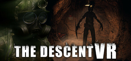
THE DESCENT VR scored 72/100 on Steam Analyzer — Good for a VR capsule. Top priority fix: [title_readability] Increase VR suffix size or integrate it into the main title treatment to ensure full product name remains readable at small and tiny sizes.

Capsule scores by dimension

  • Genre Clarity: 8/10 — Horror exploration clearly signaled. The gas mask closeup on the left and silhouetted figure in a cave tunnel on the right immediately communicate psychological horror and underground exploration. At tiny size, the dark silhouette and cave environment remain readable as horror/exploration, though the VR suffix becomes illegible. The visual language aligns well with horror walking sim expectations without ambiguity.
  • Title Readability: 7/10 — Title readable full size, VR suffix weak. THE DESCENT in bold white sans-serif reads clearly at full header size with good contrast against the dark background. However, at small size the title loses hierarchy, and at tiny size the VR suffix becomes nearly invisible, creating a potential readability collapse for the complete product name. The white letterforms maintain edge clarity but spacing becomes tight at reduced scales.
  • Contrast & Color: 8/10 — Strong value separation, warm tones pop. The composition uses high contrast between dark cave tones and bright orange-brown lighting on the right figure, plus bright white title text. At tiny size, the silhouette against warm cave glow maintains clear separation and doesn't blend into the Steam dark background. The warm orange gradient reads distinctly in grayscale and provides strong visual pop on quick scroll.
  • Uniqueness & Polish: 7/10 — Atmospheric but familiar horror template. The gas mask and cave dungeon setup effectively communicate the horror premise with professional lighting and composition. However, the imagery follows conventional psychological horror and cave exploration visual language without a distinctive hook or memorable unique selling point beyond the VR angle. The craft is competent and atmospheric but lacks the visual storytelling originality that would elevate it above genre baseline.
  • Brand Consistency: 6/10 — Coherent horror palette, limited identity. The dark green and orange color scheme is internally consistent, and the gas mask and cave environment create a recognizable horror atmosphere. However, there are no distinctive iconic symbols, character designs, or signature visual motifs that would create lasting brand recognition beyond generic psychological horror aesthetics. The presentation is coherent but not particularly memorable or unique to THE DESCENT VR specifically.
  • Composition: 7/10 — Clear focal points, balanced layout. The left-right duality of gas mask and cave figure creates visual balance with the title anchored at bottom center. At small size, both elements remain distinct focal points without competing equally, maintaining hierarchy. At tiny size, the composition still reads as horror cave exploration, though compositional depth flattens slightly. The design avoids dead center voids and uses the full width efficiently without edge-hugging issues.

What works

  • Strong color contrast on dark background. Bright white title and warm orange cave lighting create excellent separation against Steam's dark theme and remain legible at small sizes.
  • Clear genre communication via dual imagery. The gas mask and silhouetted cave figure immediately establish psychological horror and underground exploration without ambiguity.
  • Balanced compositional structure. Left-right visual symmetry with centered title creates stable, intentional layout that reads well across all viewing scales.

What hurts the capsule

  • VR suffix illegible at small sizes. The 'VR' becomes nearly invisible at small and tiny scales, losing the complete product name recognition when scrolling quickly.
  • Generic horror aesthetic without distinctive hook. The gas mask and cave environment follow predictable psychological horror templates without visual storytelling that communicates a unique selling point or core mechanic.
  • Limited brand identity and memorability. The imagery lacks iconic character design, signature symbols, or distinctive visual motifs that would enable recognition of this specific title versus other cave horror games.

Priority fixes

  1. [title_readability] Increase VR suffix size or integrate it into the main title treatment to ensure full product name remains readable at small and tiny sizes.
  2. [uniqueness_polish] Add a distinctive visual element or storytelling cue that communicates the Rockwell Mine investigation premise specifically rather than generic cave horror.
  3. [brand_consistency] Introduce an iconic symbol, character silhouette, or signature visual motif that becomes recognizable as THE DESCENT VR's core identity.

Store copy priority fixes

  1. [uniqueness] Replace "something still lingers in the dark" with a specific supernatural threat unique to Rockwell (e.g., "haunted by the vengeful spirits of miners trapped in a sealed collapse" or reference a concrete, game-specific phenomenon).
  2. [feature_communication] Add 1–2 sentences specifying what investigative tools beyond the camera players use, what collectibles entail, and how documenting evidence impacts the story or resolution.
  3. [audience_targeting] Insert a sentence clarifying the psychological horror tone: e.g., "Heavy on atmosphere and dread, light on jump-scares" or "For players who prefer mystery-solving and exploration over combat," to help horror fans calibrate intensity expectations.

Related guides

Steam app ID: 2972480 · Tags: VR, Indie, Casual, Horror, Walking Simulator