Clayers: Prologue scores 75/100 — better than 67% of Top-Down Shooter capsules (n=801).

Quick text summary

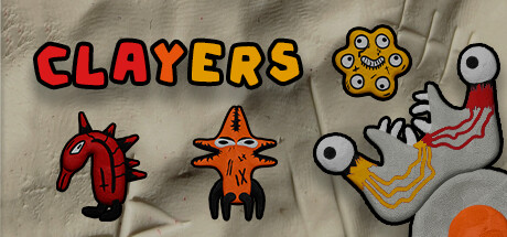
Clayers: Prologue scored 75/100 on Steam Analyzer — Good for a Top-Down Shooter capsule. Top priority fix: [genre_clarity] Add a subtle gameplay hint such as projectile trails, crosshair, or weapon silhouette to reinforce the shooting mechanic and roguelike identity

Capsule scores by dimension

  • Genre Clarity: 7/10 — Clear indie action with quirky tone. The abstract creature designs with eyeballs, tentacles, and menacing teeth clearly signal action/combat gameplay, while the clay-like textured art style and whimsical character designs suggest indie experimentation. At TINY size, the bold character silhouettes and bright color blocking still read as hostile enemies, supporting the action genre expectation, though the exact roguelike mechanic is not visually obvious.
  • Title Readability: 8/10 — Bold title stands strong at all sizes. CLAYERS uses a thick, chunky sans-serif font with strong black outlines and bright red-to-yellow gradient fill that contrasts sharply against the neutral gray-beige background. The title remains legible at SMALL and TINY sizes due to the heavy weight and outline treatment; the gradient adds visual interest without compromising clarity.
  • Contrast & Color: 8/10 — Vibrant palette with excellent separation. Bright red, orange, and yellow characters pop decisively against the muted gray-tan background, creating strong value separation. The black outlines on all elements reinforce silhouette clarity and maintain readability even at thumbnail size; grayscale conversion shows solid mid-to-light tonal separation.
  • Uniqueness & Polish: 7/10 — Distinctive clay art with coherent style. The hand-crafted clay texture and intentional grotesque character design stand out from typical action game aesthetics, communicating an experimental, indie approach. The visual language is consistent across the three creatures shown, and the overall presentation feels deliberate and polished rather than generic, though it does not convey a specific core mechanic beyond combat.
  • Brand Consistency: 7/10 — Recognizable clay aesthetic and palette. The clay-texture rendering, chunky character proportions, and warm color palette (red, orange, yellow, tan) form a cohesive internal identity that would be recognizable across marketing materials. The bold black outlines and eye-heavy character design serve as memorable motifs, though without screenshots present, full brand recognition cannot be fully assessed.
  • Composition: 8/10 — Strong hierarchy with clear focal point. The title anchors the top with confident placement on neutral background, while the three creatures below create a balanced composition with the center creature as the primary focal point due to its larger size and eye contact. The layout avoids clutter and maintains safe margins; all elements remain visible at SMALL and TINY sizes without awkward cropping.

What works

  • Bold title legibility. Black outlined gradient text reads clearly at all viewing sizes thanks to heavy weight and strong value contrast.
  • Distinctive visual identity. The clay texture, grotesque creature designs, and warm color palette create a memorable indie aesthetic that stands apart from mainstream action games.
  • Excellent background separation. Neutral gray-tan background allows bright character colors to dominate attention without visual noise or competition.
  • Balanced composition. Clear focal hierarchy with the center creature as the primary subject, flanked by supporting elements that guide the eye without clutter.

What hurts the capsule

  • Unclear core mechanic communication. While the action genre is evident, the unique roguelike or shooting mechanic is not visually communicated through UI hints or gameplay cues.
  • Abstract character design lacks context. The grotesque creatures are visually interesting but do not clearly establish enemy type, threat level, or narrative context at a glance.

Priority fixes

  1. [genre_clarity] Add a subtle gameplay hint such as projectile trails, crosshair, or weapon silhouette to reinforce the shooting mechanic and roguelike identity
  2. [uniqueness_polish] Integrate a signature visual element like a recurring symbol, UI frame, or thematic motif that reinforces brand identity across marketing

Store copy priority fixes

  1. [hook_strength] Rewrite the short description to lead with the color-matching mechanic and its core appeal: 'Mix colors in real-time combat to amplify your firepower in this psychedelic roguelike shooter' instead of generic 'Roguelike game with unique art style.'
  2. [feature_communication] Expand the color mixing section with one concrete example: explain that matching enemy color to your shot color multiplies damage, and hint at the strategic choice-making this creates.
  3. [uniqueness] Clarify what 'inspired by a time when games were trying to look unusual' means visually—replace with a specific reference or description of the art direction (e.g., 'claymation-inspired visuals' or 'low-poly dreamscape aesthetic') that differentiates from other indie shooters.
  4. [audience_targeting] Add one sentence that signals difficulty and intended playstyle: e.g., 'Built for players who enjoy roguelike challenge with a focus on creative build experimentation' to help the right audience self-identify.

Related guides

Steam app ID: 2979020 · Tags: Top-Down Shooter, Indie, Roguelike, Psychedelic, Colorful