Scoring genre clarity...
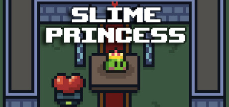
Slime Princess is a pixel style stand-alone game that combines platform action, dungeon exploration and Roguelike elements. Players will play the role of a heroic slime and embark on a challenging adventure in order to save the slime princess who has been kidnapped by evil forces.
$5.996 user reviews
Pixel GraphicsRoguelike2D Platformer
Aibit GamesMay 2, 2025