Scoring genre clarity...
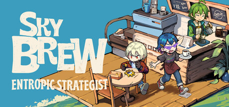
Experience entrepreneurship in a floating cloud cafe. Manage your flying cafe, customize construction, train staff, handle random events, and uncover the secrets of the commercial empire, growing from a small shop to the sky's brightest star.
$17.99Mostly Positive(525)
SimulationStrategyPixel Graphics
ATRIC GamesNov 19, 2025