Scoring genre clarity...
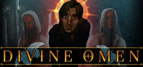
An explorative horror point-and-click adventure game where your decisions seal the fates of your companions. Explore the world to uncover what happened at Dawnhall village. Listen to the messages in Avan's dreams to determine your choices. Become what you were born to be.
$14.991 user reviews
Early AccessAdventureExploration
Ruby RingApr 25, 2026