Quick text summary
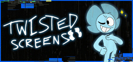
Twisted Screens scored 62/100 on Steam Analyzer — Solid for a Exploration capsule. Top priority fix: [genre_clarity] Revise character expression or pose to suggest threat, unease, or horror elements—add grimacing, tense posture, or environmental danger cues to align with thriller tone.
Capsule scores by dimension
- Genre Clarity: 5/10 — Sci-fi setting unclear genre. The capsule shows a cartoonish character in a futuristic blue suit against a dark tech-themed background, which signals sci-fi but fails to communicate the thriller or first-person horror elements. The cheerful, friendly character design at TINY size contradicts the promised grotesque experiments and mercenary narrative, creating genre confusion between lighthearted indie comedy and dark survival thriller.
- Title Readability: 8/10 — Hand-drawn neon clear. The title 'TWISTED SCREENS' uses a bold white hand-drawn neon style with strong contrast against the dark background, maintaining excellent legibility at both FULL and SMALL sizes. At TINY size the text remains readable due to the thick letterforms and high value contrast, though fine texture detail is lost.
- Contrast & Color: 7/10 — Bright character pops. The light blue character and white neon title create strong separation from the dark navy-black background, with clear silhouettes that read well in grayscale. The high-contrast approach works at SMALL and TINY sizes, though the blue is a cool tone that recedes slightly against the Steam dark background—warmer highlights on the character would increase perceived depth.
- Uniqueness & Polish: 5/10 — Generic indie sci-fi aesthetic. The capsule uses familiar indie game tropes: hand-drawn neon text, blue futuristic character, and dark tech background that closely mirrors common mid-tier indie presentations seen in Balatro and similar titles. The character design feels clean but lacks a distinctive hook or visual narrative detail that signals the grotesque horror core or mercenary scenario described in the game's premise.
- Brand Consistency: 6/10 — Consistent but generic identity. The light blue, white neon, and dark tech palette creates internal cohesion, and the character Tessa appears to be the recognizable mascot across the brand. However, the presentation lacks a distinctive signature motif or memorable visual cue that separates it from dozens of other indie sci-fi titles—the style is competent but not iconic.
- Composition: 6/10 — Centered balance with dead space. The title anchors the left side with the character positioned right of center, creating a clear two-part hierarchy that reads at SMALL size. However, significant empty space dominates the upper right and lower portions, wasting prime real estate, and the composition feels static with minimal depth layering or visual storytelling that hints at the thriller gameplay.
What works
- Strong title contrast. White neon text reads clearly at all sizes against the dark background without compromise.
- Clear character silhouette. Light blue character has clean edges and stands out distinctly from the dark environment.
- Recognizable mascot anchor. Tessa as a character focal point can serve as a consistent brand identity across materials.
What hurts the capsule
- Genre expectation mismatch. Cheerful, cartoonish character design contradicts the promised dark thriller and grotesque horror premise.
- Generic sci-fi presentation. Blue suit, neon text, dark tech background is a common indie template that fails to stand out from similar titles.
- Wasted space and static composition. Large empty regions and centered balance create a flat, uninspired layout that doesn't guide the eye or suggest gameplay.
- No narrative or mechanic hint. The capsule communicates a generic sci-fi setting rather than the abandoned facility, grotesque experiments, or mercenary core of the game.
Priority fixes
- [genre_clarity] Revise character expression or pose to suggest threat, unease, or horror elements—add grimacing, tense posture, or environmental danger cues to align with thriller tone.
- [uniqueness_polish] Introduce a distinctive visual hook specific to Twisted Screens: add a grotesque creature, glitch effect, twisted UI element, or environmental hazard that signals the game's unique horror premise and differentiates from generic sci-fi templates.
- [composition] Rebalance the layout to eliminate dead space and add depth layering—position background tech elements to frame Tessa, add a menacing silhouette or environmental detail in the background to suggest the abandoned facility threat.
- [contrast_color] Introduce warm accent colors (orange, red, sickly green) to break the cool blue-black monotone and create visual interest that signals danger or anomaly at TINY size.
Store copy priority fixes
- [feature_communication] Expand 'strange gadgets' with one concrete example: e.g., 'Use a gravity-shifting device to navigate impossible platforms' or similar specific mechanical detail.
- [feature_communication] Clarify the lore system: is it environmental storytelling, NPC dialogue, or readable logs? Example: 'Piece together dark truths through scattered ATR data logs and Legsy's cryptic commentary.'
- [audience_targeting] Add a sentence that explicitly signals casual accessibility, e.g., 'Adjustable difficulty lets you focus on puzzles or parkour at your own pace' or similar.
Related guides
Steam app ID: 3008950 · Tags: Exploration, Puzzle, 3D, First-Person, Dark Humor